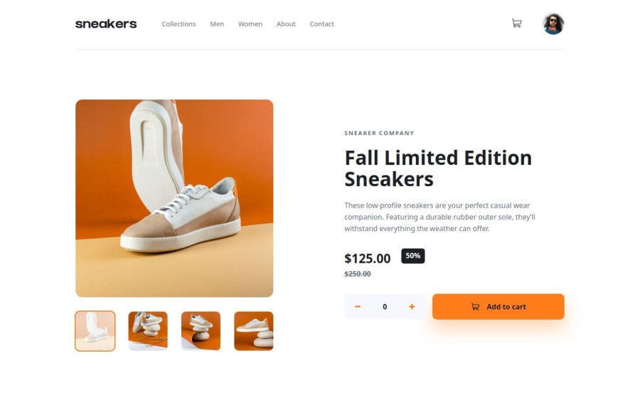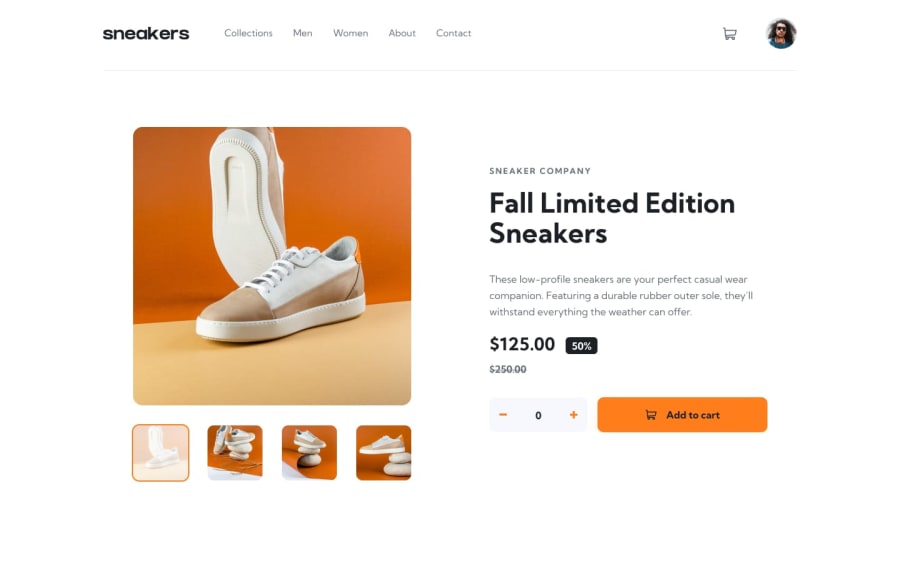
E-Commerce Product Page (JS/SCSS)
Design comparison
Solution retrospective
- My solution is not perfect and it was exhausting for me.
- I am proud of I managed to create all given features. I also added some on my own.
- I would definitely think about better structure of my code next time because I wrote in a single file and it became a bit messy.
- I implemented basic accessibility.
- The most problem was to create overlay. It did not work on my fixed positioned elements so I created their own overlay for each one. That solution could be better.
- Positioning the elements took me the most time.
Please give me some opinion or advice. 🫡
Community feedback
- @AcharaChisomSolomonPosted 10 months ago
Heyyy @bartoszdudziak-dev,
Great Job on completing the challenge, and I love how you split your css files.
The only feedback I have is that you should check out 'CSS CLAMP', it could potentially reduce the amount of media queries you need.
1@bartoszdudziak-devPosted 10 months ago@AcharaChisomSolomon Hi! Thank you! I use
clampespecially for font sizes if it is needed. Do you think is it good practice to use it for also for things like padding, margin or width?0
Please log in to post a comment
Log in with GitHubJoin our Discord community
Join thousands of Frontend Mentor community members taking the challenges, sharing resources, helping each other, and chatting about all things front-end!
Join our Discord
