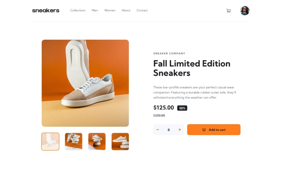
Design comparison
Solution retrospective
Here is my solution for the e-commerce-product-page challenge.
In this challenge, I used React.
Any feedback is welcome and very appreciated ! 😊
Community feedback
- @DavidMorgadePosted over 2 years ago
Hello Alain congrats on completing this challenge with React, glad to see more React developers around here!
If you don't mind I would like to give you some feedback
React:
- I saw that you are using the useMediaQuery hook, try having your hooks on a separate folder called 'hooks' in your src directory, this is just a convention, but will help a lot to organize your code.
Styles:
-
Consider using either CSS modules or Styled components, both are fine, you are using normal CSS files that can cause some class clashing, you should give a try to CSS modules, they are the same as normal CSS stylesheets for your components, but they generate random class names and will never clash with your other component classes. If you want to try a more CSS-in-JS appoach, give a try to Styled Components, they are the best option in my opinion.
-
The profile image moves a bit on hover because you are adding an extra 2px line around with
:hover { border: 2px solid orange }, you could trybox-shadowinstead, it will give you the same result but the image will stay on the same place, try with this one:box-shadow: 0 0 0 2px var(--clr-orange); -
Also don't forget to add some hover effect on the
buttonand the + - inputs, with some transitions liketransition: all 0.5s ease;to get a more modern effect, you can apply this transition also to the avatarimg.
Hope my feedback helps you! nice work man, you did a great job!
Marked as helpful1@Alain-sysPosted about 2 years ago@DavidMorgade Hey, thanks for your feedback, I appreciate it 😊
-React : I put my useMediaQuery hook in the "hooks" folder. I didn’t know this convention but thanks to you it’s learned.
-Styles : I didn’t know it could cause this kind of trouble. I will learn more about CSS modules and Styled components in my future projects in react.
Thanks to you for the animations, I forgot the
:hoveron my two buttons "quantity" and "add to cart". Also, I add more animations as you recommended to my other buttons.1
Please log in to post a comment
Log in with GitHubJoin our Discord community
Join thousands of Frontend Mentor community members taking the challenges, sharing resources, helping each other, and chatting about all things front-end!
Join our Discord
