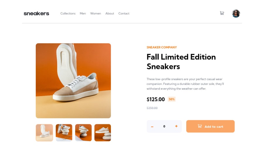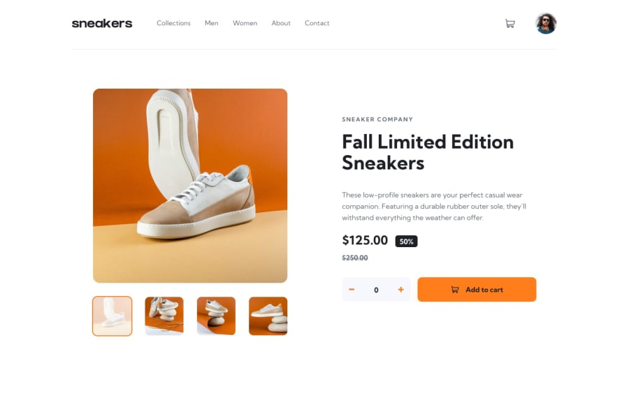
Design comparison
Solution retrospective
Any comment or feedback would be highly appreciated!
Community feedback
- @Ahmed-ElbaldPosted almost 3 years ago
Hey Anne,
I really like your solution but I think it could be better with some touches:
- All the transitions in the page happens all at a sudden like the cart and the nav. So it would be better if you added some transition-duration to those elements to make the page a little bit smoother .
- Also consider adding a
cursor: pointer;to elements that are clickable so that the user can know that it has a function to do. - Your solution doesn't allow the user to add more than one item in the cart and that's not the best thing. It doesn't also store the user's current items in any place (when the user reloads the page, all their items disappear). So my suggestion is.. you can make an array of the user's items (every item could be an object that contains the item's information) and store it in the
localStorage. After that you can make a function that gets triggered every time an update happens. This function's task will be getting the array from the local storage, making new elements as items and put them in the cart.
If you're not sure how to do any of that, you can check my solution here.
You also have some issues with accessibility. I don't mind helping you solve them.
I hope you find my feedback beneficial. Thank You
Marked as helpful0P@anne-mflPosted almost 3 years ago@Ahmed-Elbald
Hi Ahmed,
I really appreciate your feedback. I saw your solution and I liked how you made it possible to add more than one item and stored the data in local storage. That helps a lot. I would work on with the transitions hereafter.
Thanks a lot!
1
Please log in to post a comment
Log in with GitHubJoin our Discord community
Join thousands of Frontend Mentor community members taking the challenges, sharing resources, helping each other, and chatting about all things front-end!
Join our Discord
