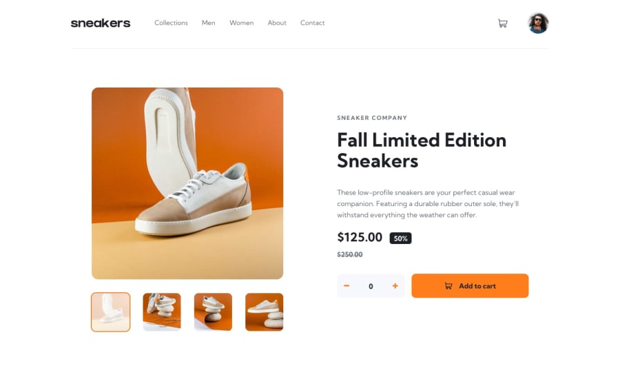
Ecommerce Product Page using html5, css and vanilla js
Design comparison
Solution retrospective
Feedbacks are welcome. Thank you.
Community feedback
- @Nam-HaiPosted almost 3 years ago
When you hover the navbar items, the border-bottom create new extra height to the navbar. To prevent this, set 'border-bottom: 2px transparent;' as default to the navbar-items. Thus the hover effect will be to change the color of the border instead of creating one.
The modal is great. However most of the time you can close a modal box by clicking on the "gre outside". Here you just had to add an event listener on #lightbox
You could have also disable the modal box for mobile view. As there is already button to go to next and previous image. Maybe you could also fix the height and width of the slides as the height change while we go from one to an other which is not that aesthetic tbh.
Side note, usually add to cart add new item in the cart. Like, if there is already 2 item in, adding 1 set the number of item to 3. Here you only reset the counter. For just a challenge it doesn't really matter, but it would not be functionnal for an actual website.
Overall nice work, keep going
Marked as helpful0
Please log in to post a comment
Log in with GitHubJoin our Discord community
Join thousands of Frontend Mentor community members taking the challenges, sharing resources, helping each other, and chatting about all things front-end!
Join our Discord
