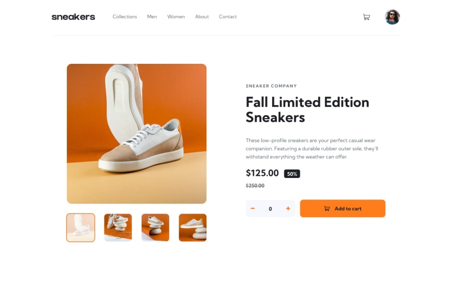
Submitted over 2 years ago
E-commerce product page using Html , Css and Javascript
@krishna8223
Design comparison
SolutionDesign
Community feedback
- @besttlookkPosted over 2 years ago
Hi there! Below are some issues I like to point out:
- You added border on menu item on hover. Which make the menu item move up while hovering. To avoid that also add border for nornal state with "transparent" color.
nav a{
   border-bottom: 4px solid transparent;
}
nav a:hover{
   border-bottom-color: var(--color-orange);

}
One pro tip: If you want to have animated hover effect on menu-item(like we have on FEM webside) , use ":after" pseudo-selector with transition. Do let me know if you wanna know how to do that. 2. I would suggest to use <li> to wrap all the list-item.
<nav> <ul> <li><a>Collections</a></li> <li><a>Men</a></li> </ul> </nav>- Add proper title rather than "document".
- Border-radius and shadow are too much for cart-box. Also add some padding of cart-header
- After adding to the cart. Reset the counter back to 0.
- If possibel aslo show number of items there in the cart over cart-icon.
Good Luck
#happyCoding
Marked as helpful1
Please log in to post a comment
Log in with GitHubJoin our Discord community
Join thousands of Frontend Mentor community members taking the challenges, sharing resources, helping each other, and chatting about all things front-end!
Join our Discord
