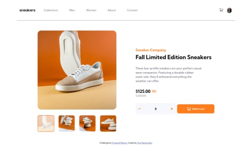
E-commerce product page using flex-box (mobile first workflow)

Solution retrospective
This took me way longer than I expected. Writing code felt a bit tedious mainly because I didn't create many js functions. I tried my best to organize my CSS. I wrote about 800 lines of CSS on my first attempt just to get a barely good looking site which was not even responsive. So I deleted everything, took a break, watched some tutorials and tried mobile-first workflow and to my surprise, it actually turned out a lot better. I wish I knew this earlier. I also came out of my pixel cave and started using more of other units. This is also my first time writing this much js and it felt quite inefficient. I tried out so many new things in this challenge and overall, I learned a lot and I'm happy with what I got. I'd very much love to hear your feedback and suggestions on how I can improve things. Happy Coding!
Please log in to post a comment
Log in with GitHubCommunity feedback
No feedback yet. Be the first to give feedback on Kaung Zin Hein's solution.
Join our Discord community
Join thousands of Frontend Mentor community members taking the challenges, sharing resources, helping each other, and chatting about all things front-end!
Join our Discord