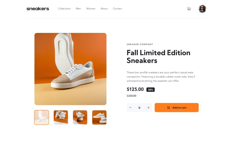
Ecommerce product page using css flexbox and vanilla js
Design comparison
Solution retrospective
With an intermediate knowledge of javascript and web page layout, the challenge was not very difficult for me.
But I am very unsure of the "IMAGE CAROUSEL ON MOBILE DEVICE" section in the javascript file. I had to hardcode it to make it work. But I want the code to be reusable. I would appreciate it if you have a look at the code and suggest me any ideas to refactor it.
Also, I would love to get some feedback on best practices in my code. I think I have messed up my css and js.
Community feedback
- @remmjiPosted over 1 year ago
Hello there , congratulations on finishing this project :)
What you may want to fix at first is counter button which has not enough width.It leads to this little vibrations between add to cart and counter btn when counter change its value.
Also on mobile those underlines in sidebar are not in right place.
Then you have this warning about unique id's on some of your div elements.
If you found this not very challenging in terms of js i strongly recommend to expand your project by some other products so you will be able to implement more advanced cart logic. I did it myself and has absolutely no regrets. Much more fun and satisfaction after ;)
Hope this was somewhat helpful. Gl on your next challenges !
Marked as helpful0@AfnanmkPosted over 1 year agoHey, @remmji thank you so much for the feedback!
the counter button and the underlines in the sidebar have been fixed. I tried to fix the counter button issue earlier but was unable to do so. But when you mentioned that it's a width problem I managed to fix it :)
As for expanding the project, I would definitely try the idea you mentioned.
1
Please log in to post a comment
Log in with GitHubJoin our Discord community
Join thousands of Frontend Mentor community members taking the challenges, sharing resources, helping each other, and chatting about all things front-end!
Join our Discord
