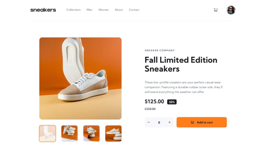
Design comparison
Solution retrospective
Another challenge completed!, I'm kinda starting to get the hang of these challenges. But I've got some questions for the community.
First, I tried to use the filter: drop-shadow() property to make the close icon and the previous and next icons orange but when I opened it in my Chrome browser, it didn't work and when I opened the Dev Tools, I found out that the filter property was striked-through so how can I fixed that?
And Secondly, the thumbnails under the product image in the design files are supposed to fade and have an orange border when hovered but due to the opacity property I applied to them, I think the border also became transparent; so how could I have made the image a bit transparent without affecting the border. Thanks for viewing my site and make sure to leave an honest feedback!. Happy coding!! :)
Community feedback
- @AdrianoEscarabotePosted about 2 years ago
Hi Ayoife, how are you?
I really liked the result of your project, but I have some tips that I think you will like:
1- All page content should be contained by landmarks, you can understand better by clicking here: click here
We have to make sure that all content is contained in a reference region, designated with HTML5 reference elements or ARIA reference regions.
Example:
native HTML5 reference elements:
<body>
    <header>This is the header</header>
    <nav>This is the nav</nav>
    <main>This is the main</main>
    <footer>This is the footer</footer>
</body>
ARIA best practices call for using native HTML5 reference elements instead of ARIA functions whenever possible, but the markup in the following example works:
<body>
     <div role="banner">This is the header</div>
     <div role="navigation">This is the nav</div>
     <div role="main">This is the main</div>
     <div role="contentinfo">This is the footer</div>
</body>
It is a best practice to contain all content, except skip links, in distinct regions such as header, navigation, main, and footer.
Link to read more about: click here
2- Why it Matters
Navigating the web page is far simpler for screen reader users if all of the content splits between one or more high-level sections. Content outside of these sections is difficult to find, and its purpose may be unclear.
HTML has historically lacked some key semantic markers, such as the ability to designate sections of the page as the header, navigation, main content, and footer. Using both HTML5 elements and ARIA landmarks in the same element is considered a best practice, but the future will favor HTML regions as browser support increases.
Rule Description
It is a best practice to ensure that there is only one main landmark to navigate to the primary content of the page and that if the page contains iframe elements, each should either contain no landmarks, or just a single landmark.
Link to read more about: click here
The rest is great!!
Hope it helps...👍
0
Please log in to post a comment
Log in with GitHubJoin our Discord community
Join thousands of Frontend Mentor community members taking the challenges, sharing resources, helping each other, and chatting about all things front-end!
Join our Discord
