Submitted about 3 years ago
E-commerce product page Using Astro build
@Artmade-studio
Design comparison
SolutionDesign
Community feedback
- @markteekmanPosted about 3 years ago
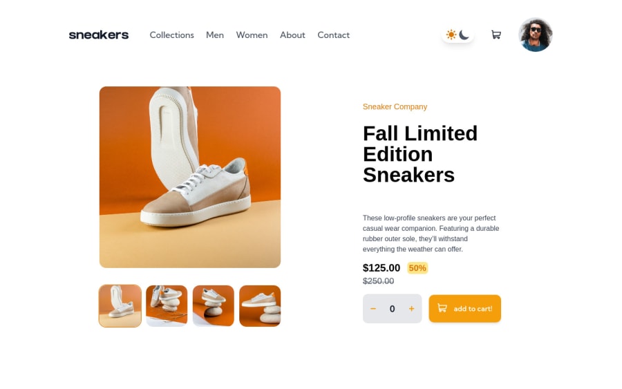
Very nice solution you made here! I really love seeing you've used Astro :) I've got a couple of pointers to further improve your code and the user experience of your solution:
- Your menu items are all
<h1>'s, for accessibility it's important to only use one<h1>per page. You could instead just put your menu items in the<a>tag alone and apply the necessary styling there - When hovering over the menu items they become bold and this creates a shift in layout. You can solve this by setting your menu items inside unordered list items and apply a
min-widthon them to prevent this shifting. I did the same for the menu in this solution: https://markteekman.github.io/easybank-landing-page/ - Consider adding
cursor: pointerto your light and dark mode toggles to make it more clear to the user that it's interactive - On a single product page you can apply a
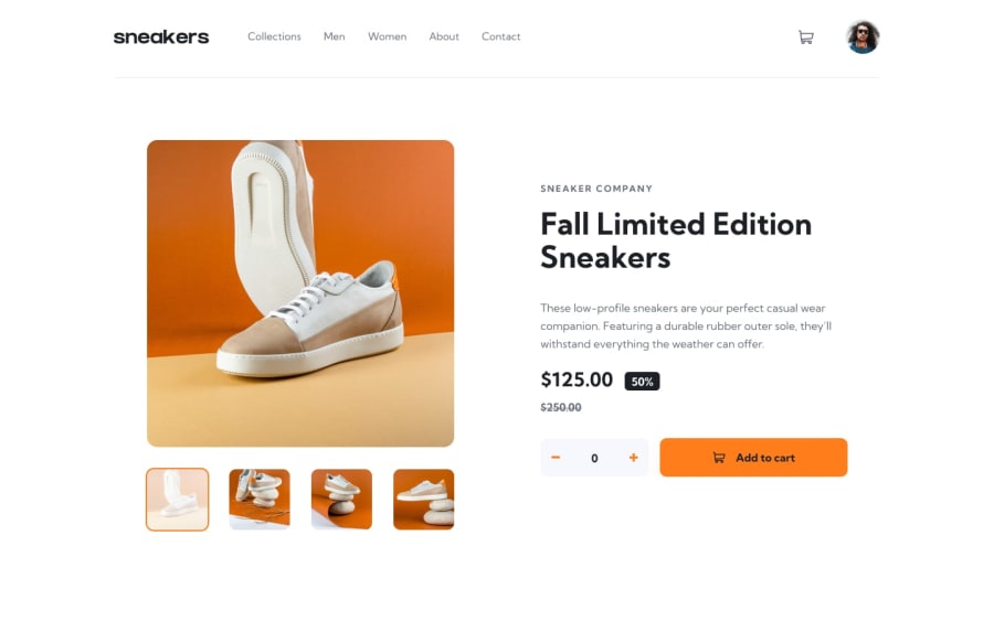
gap: 2remproperty on the parent div that wraps the little preview images to give them some space like the original design - Consider putting some padding on the container for smaller viewports on the single product page, that way there will be some breathing room between the big image and the browsers edge
- Checkout Frontend Mentors report on your solution, it's a great way to learn more about accessibility and correct HTML mark-up
Hope these help, keep up the great work and keep it up with Astro! :D
Happy coding! Mark
Marked as helpful1@Artmade-studioPosted about 3 years agoThanks definitely great feedback will work on your point and update my solution @markteekman
1 - Your menu items are all
Please log in to post a comment
Log in with GitHubJoin our Discord community
Join thousands of Frontend Mentor community members taking the challenges, sharing resources, helping each other, and chatting about all things front-end!
Join our Discord
