Submitted almost 2 years ago
E-commerce product page - Tailwind CSS, React, Framer Motion & Vite
#accessibility#framer-motion#react#tailwind-css#vite
@darryncodes
Design comparison
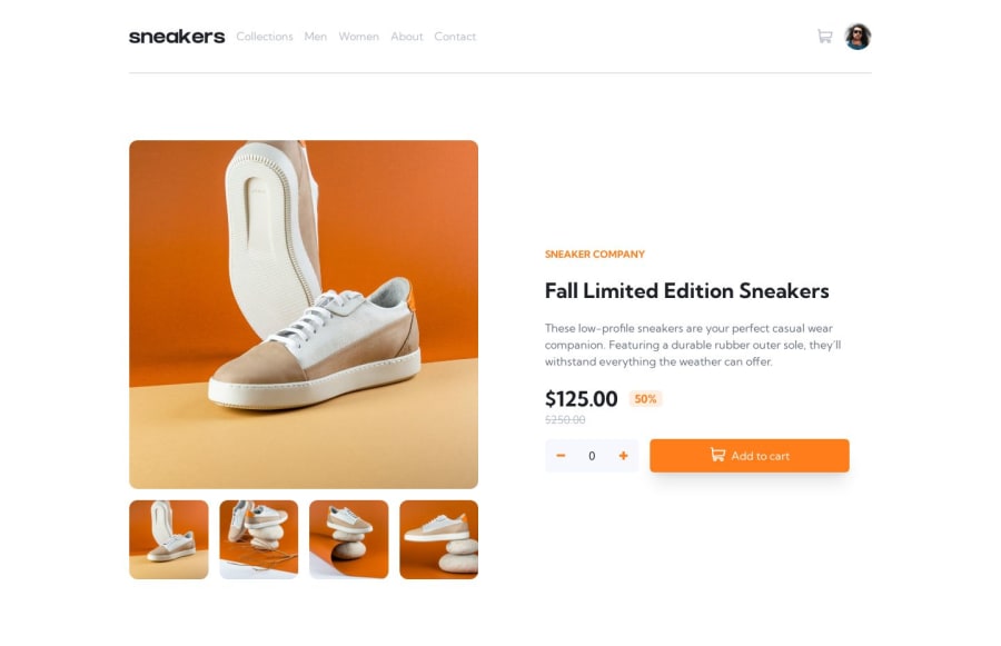
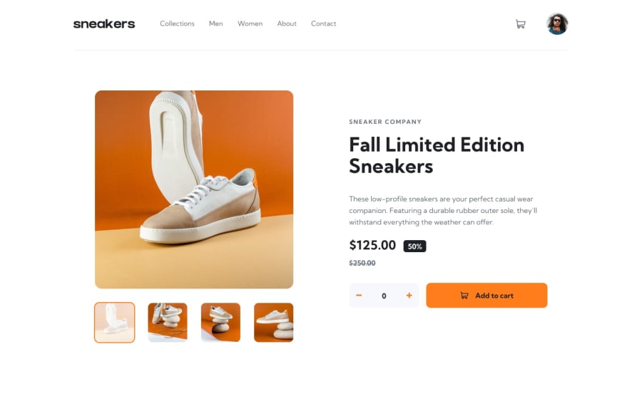
SolutionDesign
Solution retrospective
Hi everyone 👋
I had a lot of fun with this challenge!
The shopping cart functionality is the perfect use case to learn React's useContext hook. I also really appreciated Tailwind CSS helping to speed up the development process to focus on learning React.
A nice little addition was playing around with framer-motion & react-toastify.
Any feedback that could help me to improve would be very welcome.
Happy coding 🤙
Community feedback
Please log in to post a comment
Log in with GitHubJoin our Discord community
Join thousands of Frontend Mentor community members taking the challenges, sharing resources, helping each other, and chatting about all things front-end!
Join our Discord
