Design comparison
Solution retrospective
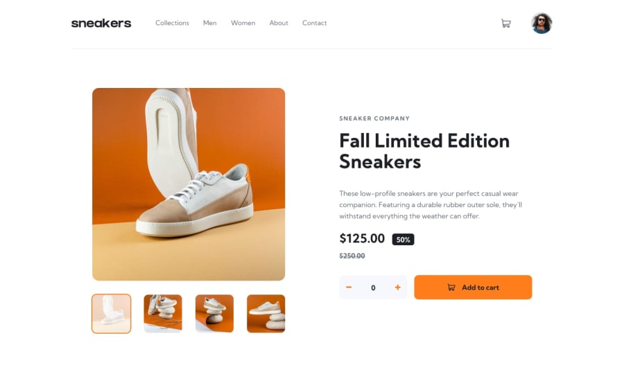
I'm not sure what I did, but everything in the header component doesn't work after it goes from mobile view to desktop view. The rest of the functionality works.
Community feedback
- @ZeyadMohamed1805Posted almost 2 years ago
Hello there! Thats amazing progress you've made out there! Responding to your question, the problem with your header in the desktop version is that it is underneath your main section. Now a quick fix for that is to simply add the "z-index: 999;" css property to your header. This way, it will always be above your main. However, It is not a very clean way to build the website because your header and main will still be overlapping, its just that now the header will be above the main. The approach that you should take is to not make them overlap with each other at all. I hope this helps a little. Please check out my solutions and react / comment to them. It really helps!
1
Please log in to post a comment
Log in with GitHubJoin our Discord community
Join thousands of Frontend Mentor community members taking the challenges, sharing resources, helping each other, and chatting about all things front-end!
Join our Discord
