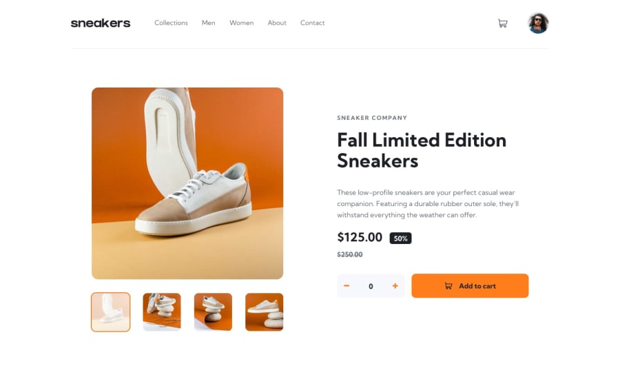
Design comparison
Solution retrospective
Thanks for checking out my solution!
This was a pretty fun challenge. It took me a little longer than expected, but breaking down all of the functions and coding them up one by one helped me not feel so overwhelmed. It's not a pixel perfect solution and some of the medium screen sizes don't scale perfectly but it gets the essence of the design pictures I feel. (Looking back i realize i forgot to add the notification icon when an item is added to the cart. I will have to update my solution with that).
I wanted to make this using Svelte, and I have to say it was awesome to work with! Very natural to jump right in if you know the basics of HTML, CSS, and Javascript. DEPLOYING it is a whole other story. I was going to deploy on my VPS but I could not find any documentation on doing so from Svelte. I will probably have to read the Vite docs for guidance.
Overall, there is some repeated code that I will have to go back and refactor eventually. Any suggestions on how to minimize the repetition or get smoother screen transitions are welcome!
Community feedback
- @Captressketh001Posted about 2 years ago
Weldone on completing this challenge @PaletteJack. You really did a great job.
I noticed the attribution text (Challenge by Frontend Mentor. Coded by PaletteJack.) is displaying on the sneaker image. You can comment out the position:absolute property in your .attribution.svelte-1u9dmka.svelte-1u9dmka class to solve this.
@media screen and (min-width: 1080px) .attribution.svelte-1u9dmka.svelte-1u9dmka { /* position: absolute; */ bottom: 0; left: 0; right: 0; }1
Please log in to post a comment
Log in with GitHubJoin our Discord community
Join thousands of Frontend Mentor community members taking the challenges, sharing resources, helping each other, and chatting about all things front-end!
Join our Discord
