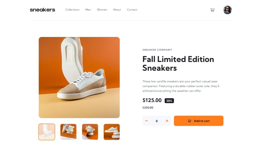
E-commerce Product Page || SCSS + React-Redux
Design comparison
Solution retrospective
Hey guys!
I'm back with another front-end project. This time, I decided to finally implement Redux in my project and I found it to be an incredibly fun and insightful experience. It was a bit more difficult in the beginning since I was learning on the go, but after I grasped the concepts, it became clear what I had to do.
What would've you done differently in this project?
Let me know your thoughts - much appreciated! :)
Community feedback
- @skyv26Posted almost 3 years ago
Really nice and smooth design, good 👍👍
1@MiculinoPosted almost 3 years ago@skyv26 thanks for checking out my work - much appreciated! ;)
1 - @menoo20Posted almost 3 years ago
this is also one of the greatest applications for this challenge. your design is very good and you could cover most of both the design and functionality needed. using react and redux in such a design is also a good practice. the only typo I could find is actually in displaying the lightbox and as It doesn't cover the whole page with a dark bg. I think you need to check about it. also, the buttons for changing the slide backward and forward are missing. but other than that I think the website is working fine.
0
Please log in to post a comment
Log in with GitHubJoin our Discord community
Join thousands of Frontend Mentor community members taking the challenges, sharing resources, helping each other, and chatting about all things front-end!
Join our Discord
