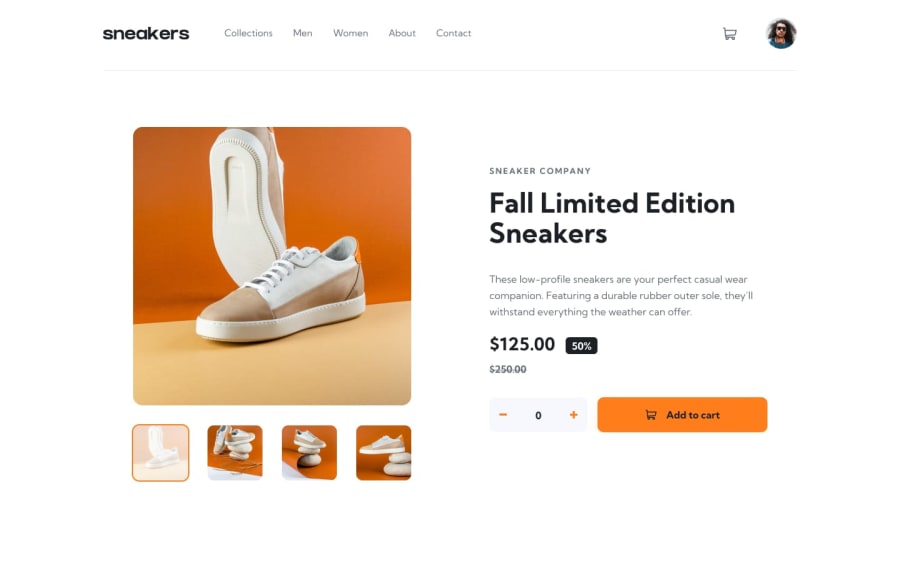
Ecommerce Product Page - Responsive and Everything works
Design comparison
Community feedback
- @FredZabuPosted about 2 years ago
Hi Sayed i checked on your code and am really in love with the way you write your code ie giving class names, IDs to your elements just makes it easier for one to understand the code thus i look forward to improving mine.
Marked as helpful1@msabdalaalPosted about 2 years ago@FredZabu Hi Fred, thx so much for the feedback I am glad that you liked my code, Hope you get better and better too. Happy coding.
0 - @Deevyn9Posted about 2 years ago
Hi Mohamed, congrats on completing this project, you solution is really good. However, you should add a margin top to the add to cart button. Also, the number of cart items indicator isn’t appearing.
I hope you can find a solution and you also find this comment helpful.
Happy coding!
Marked as helpful1@msabdalaalPosted about 2 years ago@Deevyn9 ,
Hi Divine, Thx so much for the feedback appreciate it. I added the number of cart items indicator, However, I can't see why should I add a margin-top to the add to cart button. Hope you take a look and clarify if there is anything that needs to be done.
Thx again for the feedback ❤️
1@Deevyn9Posted about 2 years ago@msabdalaal hi Mohamed, I’m glad you found my comment helpful, for the margin, on my device the button and the increment element are in contact, it might not bd the same on your device however, try it out on other devices.
Marked as helpful1@msabdalaalPosted about 2 years ago@Deevyn9 , Hi Divine, I did replace the gap property with a margin-top, hope that fixes the problem for your device.
1
Please log in to post a comment
Log in with GitHubJoin our Discord community
Join thousands of Frontend Mentor community members taking the challenges, sharing resources, helping each other, and chatting about all things front-end!
Join our Discord
