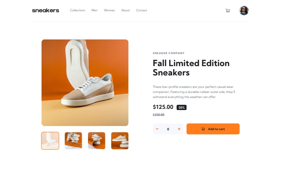
Design comparison
Solution retrospective
This has a known CSS issue with Safari which I'm still working on - sorry!
I struggled with the border and transparent colour over the selected thumbnails. Couldn't figure out how to add a border without 'squashing' the image within the div. The same issue is apparent with the hover effect over the profile.
This challenge was pretty difficult for me as I'm still getting my head around React. I also experimented with Tailwind, but found it was getting a bit messy as the project grew. I might stick with plain CSS for a while!
In the end, pretty happy with the design and functionality, with a few CSS mistakes to iron out.
Community feedback
- @Deevyn9Posted over 2 years ago
I’m using safari, with 375px width
Marked as helpful1 - @Deevyn9Posted over 2 years ago
Hi Jack, great stuff. The code runs excellently, however the paragraph on the mobile view is crashing on the carousel, you need to get it fixed.
Good luck!
0@jtubbenhauerPosted over 2 years agoHey @Deevyn9, thanks for letting me know.
Can I ask what browser you're using? I can't seem to replicate the bug.
0
Please log in to post a comment
Log in with GitHubJoin our Discord community
Join thousands of Frontend Mentor community members taking the challenges, sharing resources, helping each other, and chatting about all things front-end!
Join our Discord
