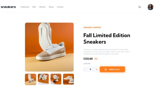
e-commerce product page (React + TS, SCSS)

Solution retrospective
I'm proud of how I managed context state: finding a solution to first update the counter component, then pass it to cart and finally activate it with "button" - add to cart - component, it wasn't that obvious for me how deal with it. Another thing I'm proud of is, that I made use of framer motion for the Lightbox.
Next Time I plan to go mobile first. This time it took me a while to get the responsive style.
What challenges did you encounter, and how did you overcome them?Working with and styling svg files was somewhat cumbersome. But I found a great article, describing multiple ways to handle svg's in css and react.
What specific areas of your project would you like help with?I'm open for any suggestions to improve my code.
Please log in to post a comment
Log in with GitHubCommunity feedback
No feedback yet. Be the first to give feedback on Cipi's solution.
Join our Discord community
Join thousands of Frontend Mentor community members taking the challenges, sharing resources, helping each other, and chatting about all things front-end!
Join our Discord