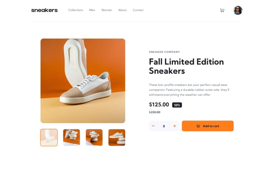
Design comparison
Solution retrospective
Hi there!, I’m Federico and this is my solution for this challenge.
Built with React and TailwindCSS.
This is the second time i use React and tailwind together and I must say I love this combination. I found the process to be very smooth and organic, easily reusing code and styling my components. I'm also very happy with the final result.
I would like some advice for styling screens around 770px. I realize those screens aren't very common, but I always find it hard to get them looking good.
Thank you 😊
Community feedback
- @remmjiPosted over 1 year ago
Hello there! 👋
💡In regards to your question about styling screens, I would recommend avoiding hard coding font sizes. Instead, try to use one measurement for everything and stick with it. Personally, I prefer to use vw for everything to get the best results. Additionally, you can use proper media queries around 50em width to adjust the layout as needed. This will help ensure that your website looks good on screens of various sizes.
💡One thing to note is that your project doesn't currently have a lightbox, which could be a nice addition to mimic an e-commerce site. It's not very hard to implement, and it would add a great deal of functionality to your project.
💡Another suggestion I have is to position the cart window near the cart icon. To achieve this easily, you can give the parent element a position of relative and the cart window a position of absolute.
I hope these tips will help you tune up your project ;)
Marked as helpful0
Please log in to post a comment
Log in with GitHubJoin our Discord community
Join thousands of Frontend Mentor community members taking the challenges, sharing resources, helping each other, and chatting about all things front-end!
Join our Discord
