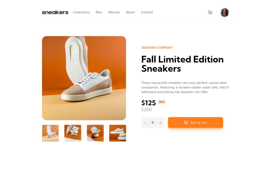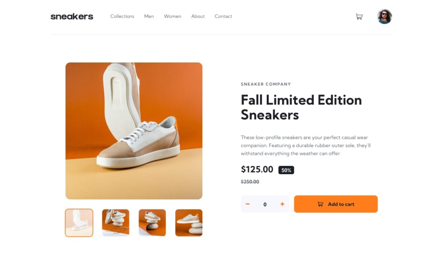
E-commerce product page (React + Tailwind)
Design comparison
Solution retrospective
Check out the animation when you add an item to cart, open the mobile menu, and opening the cart 🙃
What did I find difficult?
I am still struggling to position the basket dropdown correctly as I resize the screen down to the mobile + tablet size.
Does anybody know why my product text is not rendered the same as the screenshot?
Most difficult element of this project was using relative positioning for parts of the lightbox and the basket. This was good because I haven't yet had this type of challenge so far. I now have a few examples I can look back on in this project.
I changed the lightbox around a little bit because I didn't like the UX of the lightbox presented :)
Community feedback
- @AlyferJTPosted over 2 years ago
That is pretty good, just need more eye work on it. And a little of hover effects would be pretty cool. Nice work!
Marked as helpful1@thevolcanomanisherePosted over 2 years ago@AlyferJT I just noticed that the screenshots don't render the exact same as the actual website that is deployed!
1@thevolcanomanisherePosted over 2 years ago@AlyferJT I have since updated the design. Added animations for menu on mobile, cart opening, adding items to the cart :)
1 - @KingSkyrosPosted over 1 year ago
Hi, this project looks awsome and well done on completing it. :)
1
Please log in to post a comment
Log in with GitHubJoin our Discord community
Join thousands of Frontend Mentor community members taking the challenges, sharing resources, helping each other, and chatting about all things front-end!
Join our Discord
