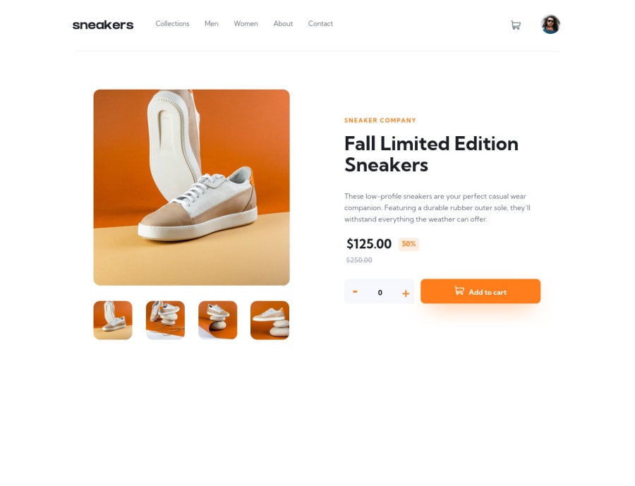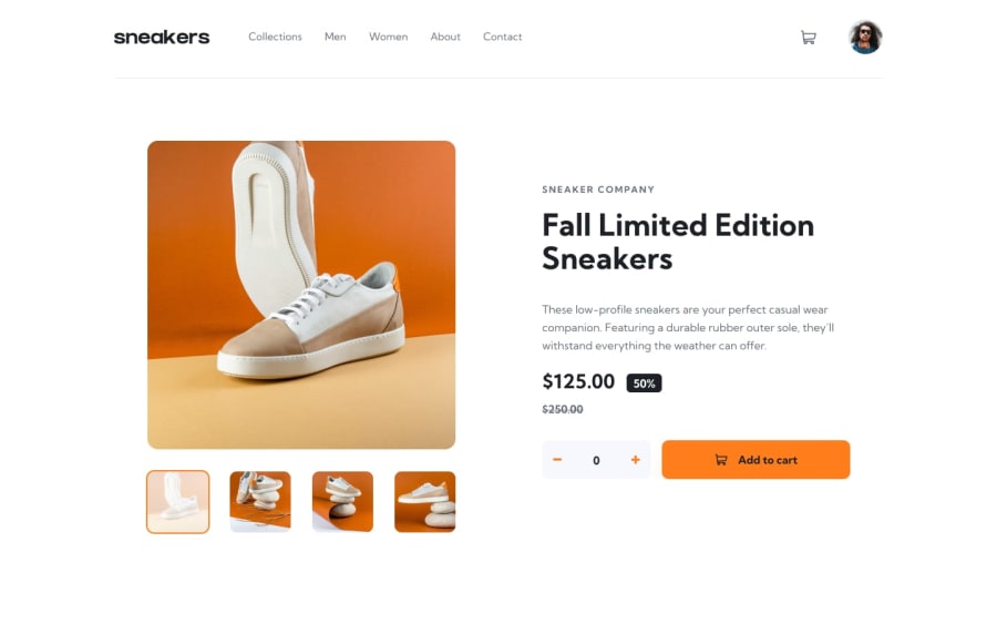
E-commerce product page (React JS + Sass/Scss)
Design comparison
Solution retrospective
🐧 Hello, I'm Daniel this is my solution for this challenge.
𝗪𝗵𝗮𝘁 𝗶 𝘂𝘀𝗲𝗱 💻
• React
• Scss
𝗔𝗯𝗼𝘂𝘁 𝘁𝗵𝗲 𝗰𝗵𝗮𝗹𝗹𝗲𝗻𝗴𝗲 👨💻
I really enjoyed doing this task, I learned a lot of new things for myself and upgraded some skills
If you have any suggestions on how I can improve my code then I will be very happy.
Community feedback
- @thelouisgramPosted over 1 year ago
-Set a height for your pictures div on mobile device, let's says width:100% and height:425px, then use object-cover on it, this way, the picture covers the width of the screen and a certain height and displays a good chunk of the pictures without stretching or looking absurd as this. -set a different padding in your header for mobile devices, don't share with large screens
0
Please log in to post a comment
Log in with GitHubJoin our Discord community
Join thousands of Frontend Mentor community members taking the challenges, sharing resources, helping each other, and chatting about all things front-end!
Join our Discord
