Submitted over 1 year ago
E-Commerce Product Page - REACT & TAILWIND CSS
#react#tailwind-css#animation
@SameerJS6
Design comparison
SolutionDesign
Solution retrospective
Hello Frontend Mentor Community,
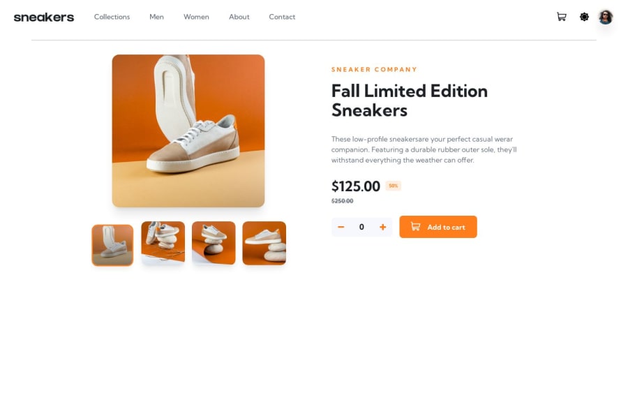
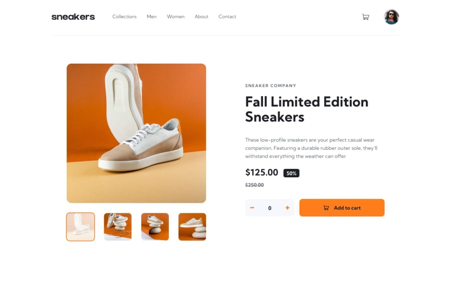
About a year ago, I tackled this challenge for the first time, dipping my toes into React. I tried to add features like a cart, dark theme, and image slider with fancy animations, but let's just say it was a learning experience!
Fast forward to now, and I'm back with more experience under my belt, ready to give it another shot. Here's what's new:
- A dark theme that sticks around, even when you close your browser.
- A slick Dark Theme that changes the look.
- An Image Slider that's not just pretty but has cool animations.
- A much better Cart Functionality.
I'd love to hear your thoughts and suggestions. Thanks for being awesome!
Cheers, SameerJS6
Community feedback
Please log in to post a comment
Log in with GitHubJoin our Discord community
Join thousands of Frontend Mentor community members taking the challenges, sharing resources, helping each other, and chatting about all things front-end!
Join our Discord
