Submitted over 1 year ago
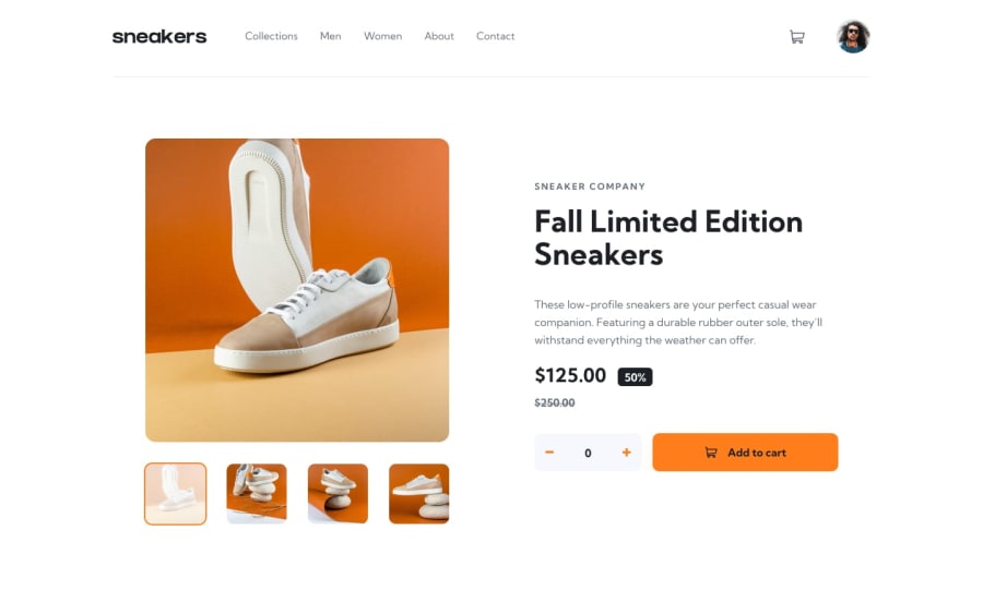
Ecommerce product page (React and Tailwind)
@abhijithmuthyala
Design comparison
SolutionDesign
Solution retrospective
Technologies / Concepts used:
React:- State, reducers, effects, context, custom hooks.
- Composition pattern to decrease prop-drilling.
- Kept state close to the components that directly need it, to decrease unnecessary rerenders.
Tailwind- I initially started out withsass, but it quickly became a pain to handle so many different files for components and styles. I've been using some reusable classes like.align-centerin the challenges done so far, so switching totailwindfelt natural. Also, no more thinking hard for a class name on adivthat is used just for layout!- Browser API's:
dialogElement.showModal()anddialogElement.close(): For better accessibility, as recommended by MDNwindow.matchMedia: To conditionally render the lightbox component.
Community feedback
- @abhijithmuthyalaPosted over 1 year ago
Update: Added the experimental
view transitionsand just like that, the links menu, cart and lightbox all animate with a nice default fade animation! Works in chrome 111+.0
Please log in to post a comment
Log in with GitHubJoin our Discord community
Join thousands of Frontend Mentor community members taking the challenges, sharing resources, helping each other, and chatting about all things front-end!
Join our Discord
