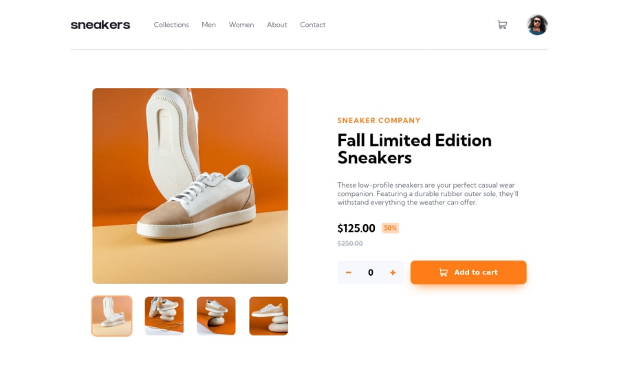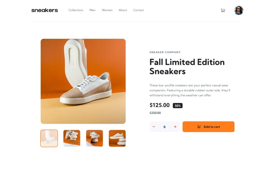
E-commerce product page REACT
Design comparison
Solution retrospective
Hi, this is the most complex project that I did ever, I appreciate all feedback and opinions to improve my skills.
thanks, have a good weekend!
Community feedback
- P@FluffyKasPosted almost 3 years ago
Hiya,
It looks seriously great! Mobile and desktop views are both nice, only the in between sizes that need some adjustment (the breakpoint switches to desktop view way too early, at 500px and the content obviously doesn't fit into that width).
There a few other small things to note:
-
Your images are missing alt texts. All images must have these, they're there to provide a text alternative for people who can't see the images. If you consider any of these images decorative only, you can simply leave the alt text empty and add an "aria-hidden-true" to it.
-
It would be nice if the "Add to cart" button had some kind of hover state. Also watch out for the font-family, for buttons you manually need to set this (right now it's using the browser's default font-family).
-
In the navbar, you could wrap the navbar items in a <a> tag, as they're links.
-
The shopping cart should be probably a button, as it does something when you click on it. This also doesn't have any sort of text description that would indicate what happens when you click on it so perhaps aria-label and aria-expanded (since there's a popup when you click on it) attributes would be appropriate here.
-
Same goes to the counter that adds or removes items. These should also be buttons with aria-labels added to them.
I hope this helps a bit. Happy coding!
Marked as helpful2@sandlerzPosted almost 3 years ago@FluffyKas thanks Fluffy, I'm gonna work on that issues. I appreciate a lot
0 -
Please log in to post a comment
Log in with GitHubJoin our Discord community
Join thousands of Frontend Mentor community members taking the challenges, sharing resources, helping each other, and chatting about all things front-end!
Join our Discord
