Design comparison
SolutionDesign
Solution retrospective
Nice Chanllenge !!!
Community feedback
- @sulemaan7070Posted almost 2 years ago
hey @Ianmello10 😄, great job here are a few things you can do to make your site better..
- Firstly the functionality which seems missing is the
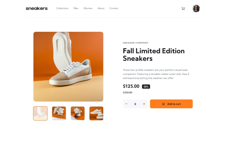
delete-buttoninside the cart you can add that. 2.Theplusandminusbuttons seem to be in reverse order... you can flip them... 3.you can add adrop-shadowto the add to cart button. 4.for the info below the heading the color should begreycolor.. everything else is working good job💯,happy coding🔥🔥
Marked as helpful0 - Firstly the functionality which seems missing is the
Please log in to post a comment
Log in with GitHubJoin our Discord community
Join thousands of Frontend Mentor community members taking the challenges, sharing resources, helping each other, and chatting about all things front-end!
Join our Discord
