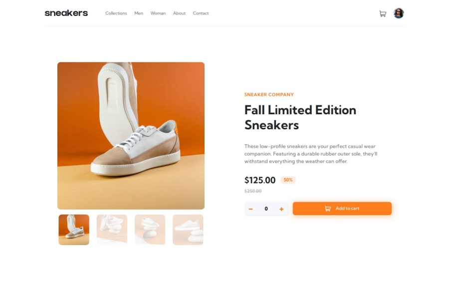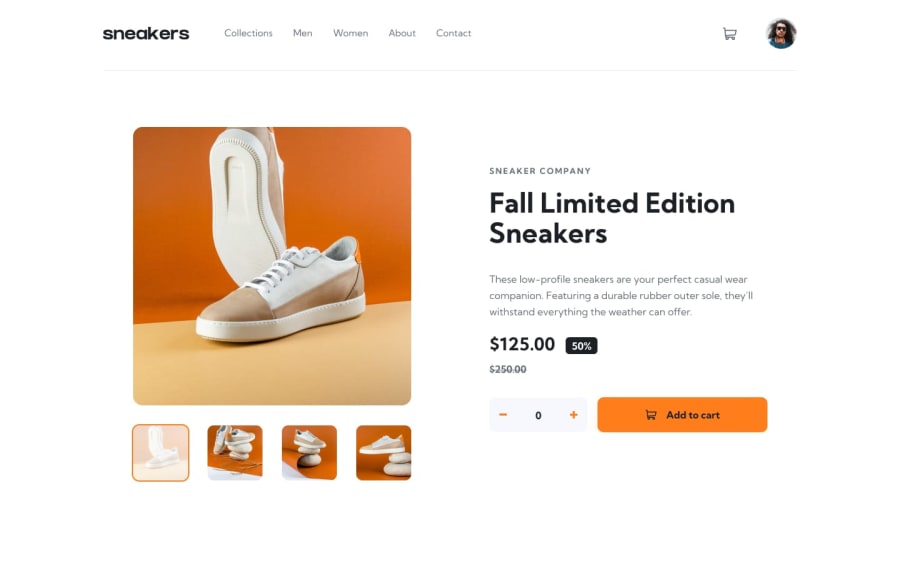
Design comparison
SolutionDesign
Solution retrospective
What are you most proud of, and what would you do differently next time?
I am proud of the functionality of this project. Also the way my solution responds to resizes make me very happy.
What challenges did you encounter, and how did you overcome them?I had a hard time making the swiperJS carousels responsive. Also my navbar was very different from the design in the first place. I had a hard time to rearrange all the elements to make it look like (and functional) like the design.
What specific areas of your project would you like help with?I would like to get tips about writing consistant JavaScript. My code looks like a mess to me, so I think I have a lot to improve. Feedback is appriciated!
Community feedback
Please log in to post a comment
Log in with GitHubJoin our Discord community
Join thousands of Frontend Mentor community members taking the challenges, sharing resources, helping each other, and chatting about all things front-end!
Join our Discord
