Submitted about 2 years ago
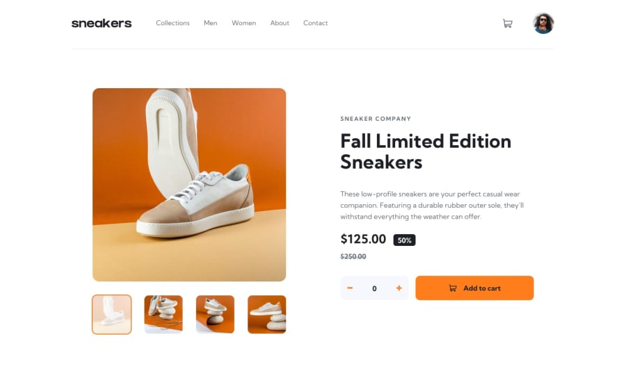
Ecommerce product page main
#animation#sass/scss#semantic-ui
@Matizeq
Design comparison
SolutionDesign
Solution retrospective
Hi, another project is done. Check it and give advices or tips what I can improve.
Community feedback
- @sonmikrafftPosted 9 months ago
Great Work! I like your design decisions for the discount and the button. You could still add the orange border-bottoms for the desktop menus in the header and take care of images. They do not keep their proportions but stretch when the viewport size changes.
0
Please log in to post a comment
Log in with GitHubJoin our Discord community
Join thousands of Frontend Mentor community members taking the challenges, sharing resources, helping each other, and chatting about all things front-end!
Join our Discord
