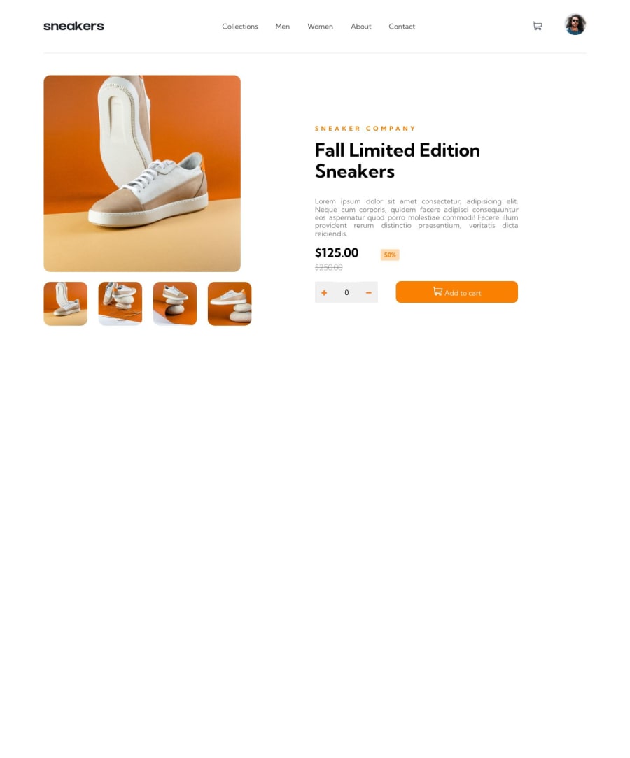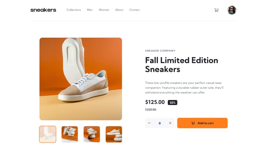
Design comparison
SolutionDesign
Community feedback
- @azick99Posted over 1 year ago
Well-done Hoda! I see you did a lot and I like your css code.
However, I got some advice to improve your code and user-experience.
- Do not use
width: 1160px;it can look like well in your PC but user will have different screens that developer must consider. Try to find better alternative likewidth: 90vw;. Bonus for user-experience make border of image avatar: instead of.user-profile{ height: 3.8rem; cursor: pointer; } .user-profile:hover{ border: 2px solid #f98001; border-radius: 50px; }make.user-profile{ height: 3.8rem; cursor: pointer; border: 2px solid #fff; border-radius: 50px; }thenhover: {border-color:#f98001}. - In page you got a bug in functionality, when you open dropdown and at the same time modal popup close disappears under dropdown, and you can close the modal. To solve it make
z-indexof popup higher and dropdown lower. - Try to improve your JS code, there are too many repetitions, work with functions that handles most problems.
I hope it would be useful. Keep coding!!!
Marked as helpful0@Hoda96Posted about 1 year agohello dear@azick99 thanks for your attention and advises. I`m new to js and really need these kind of tips. thanks again.
0 - Do not use
Please log in to post a comment
Log in with GitHubJoin our Discord community
Join thousands of Frontend Mentor community members taking the challenges, sharing resources, helping each other, and chatting about all things front-end!
Join our Discord
