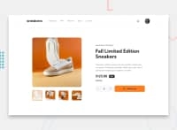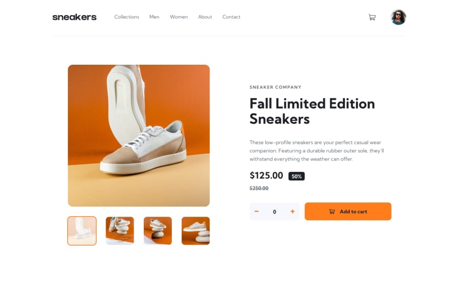
Design comparison
SolutionDesign
Community feedback
- @eddybproPosted over 1 year ago
Hi, guptaryan73
Congratulation on finishing this challenge, I hope it was fun.
Here are some suggestions that might improve the code:
- HTML code:
<button class="mobile__nav-trigger"> <!-It's better to use the 'button' tag instead of the anchor tag in the 'mobile__nav-trigger and also for 'anchors' with class: 'mb-row', 'left', 'right', 'lightbox__close-btn'-> </button>- CSS code:
/*The button with the class "lightbox__close-btn" not displaying correctly here is a way to fix it:*/
.light-box {
min-height: 100vh;
padding-top: 5.625rem;
}

/*The image with the class 'product__img-principal' should have cursor pointer when we hover over it*/
.product__img-principal:hover{
cursor: pointer;
}
Tip
It's better to use relative values
rem eminstead of absolute valuespxwhich helps makes your website render well in small screen sizes.HAPPY CODING
0
Please log in to post a comment
Log in with GitHubJoin our Discord community
Join thousands of Frontend Mentor community members taking the challenges, sharing resources, helping each other, and chatting about all things front-end!
Join our Discord

