


@DavidMorgade
Posted
Hello man congrats on finishing the challenge!
-
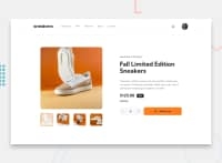
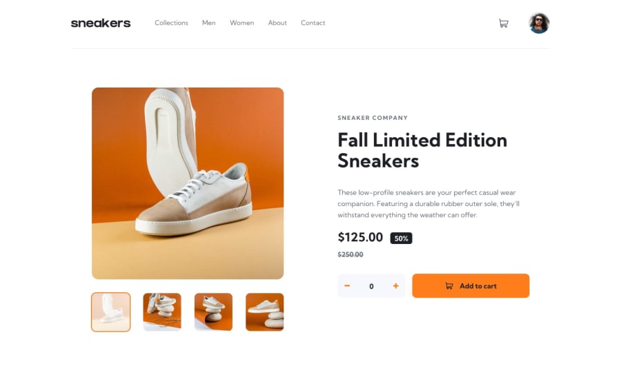
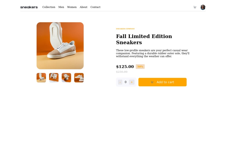
Your site looks good at desktop sizes but doesn't have a layout for mobile devices!, maybe try getting it responsive for future challenges?, you could try a mobile first approach, where you start building your project from a mobile width and then adapt it to tablet / desktop sizes using media querys.
-
Also try using more html semantic tags such as
main,section,header,footerinstead of usings divs everywhere!, also don't forget to edit your<head>with a title and adding afaviconwould be great too! -
And finally would recommend you to not use px for sizes, try better with rems or %, it will be easier to get a responsive site !.
Hope my feedback helps you for future projects!
Marked as helpful
@Adebowale3
Posted
@DavidMorgade Thank you very much for your feedback..I really appreciate it.. although that solution was specifically designed for desktop view only, and not designed for mobile view. I just realised there are more to be done which I will do and after which i will re-submit my solution. I have taken your advice on board and will work on using more html semantics tags ...Thanks
