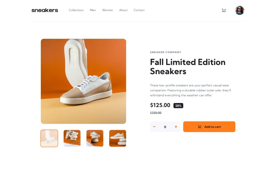
Design comparison
SolutionDesign
Solution retrospective
- Styling separation is a little bit messed up.
- Should've used thumbnail html template in lightbox gallery as well
Would love to see feedback for layout part of the project.
Particularity, about site layout in general.
Cart modal content layout could also be not in a grape shape.
Join our Discord community
Join thousands of Frontend Mentor community members taking the challenges, sharing resources, helping each other, and chatting about all things front-end!
Join our Discord
