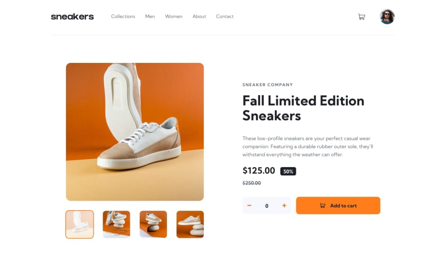
Design comparison
SolutionDesign
Solution retrospective
Only a desktop version
Community feedback
- @MuazzyPosted over 2 years ago
Nice work Ewellna, Just a few suggestions:
- if you want to make your design pixel perfect (as close to the design), then set max-width: 1440px of the main container, and then code accordingly
.container { max-width: 1440px; }
- Avoid using <section> unnecessarily, only use it when you have some heading <h1......h6> inside it, otherwise it will give these weird issues of Html validation. Use <div> instead
Marked as helpful1
Please log in to post a comment
Log in with GitHubJoin our Discord community
Join thousands of Frontend Mentor community members taking the challenges, sharing resources, helping each other, and chatting about all things front-end!
Join our Discord
