Design comparison
SolutionDesign
Solution retrospective
As a new developer I'm open to feedback on all areas of code, where I can improve, best practices, etc. I am still refining my skills using pure css to create responsive designs for mobile, tablet, desktop. Thanks!
Community feedback
- @Nnadivictory25Posted almost 2 years ago
Heyy man , just checked out your solution Here are some things I think might be helpful
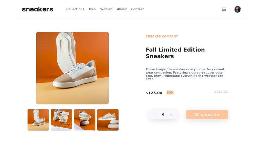
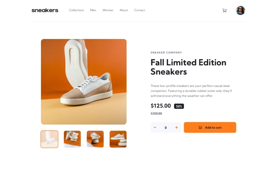
- Your font weight on the navbar and the product info paragraph is too bold
- Also the cart doesn't have any background color , rather I think u should set a lower opacity then on hover it'll be back to 1
- In the cart , the img is not displaying or maybe you didn't include the img there? even the total is not being calculated
- The thumbnails should overflow relative to the main top image and the active image should be indicated on the thumbnail images too
- The old price is under the price not on the same line with it on desktop
0
Please log in to post a comment
Log in with GitHubJoin our Discord community
Join thousands of Frontend Mentor community members taking the challenges, sharing resources, helping each other, and chatting about all things front-end!
Join our Discord
