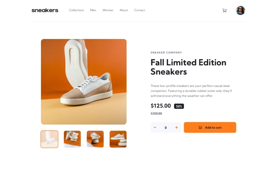
Design comparison
SolutionDesign
Solution retrospective
Any feedback is very much appreciated
Community feedback
- @iDamjanPosted over 1 year ago
I think your project looks great, nice structured css. I would add a suggestion. Look into BEM naming convetion of classes, take a look at SCSS and use that instead of regular CSS (you will love it), pay attention on acesibility meaning, if its intended to be a button, add a button html element not link (regarding to the navbar cart), that should be a button and not a link, since it doesn't navigate anywhere.
Overall nice, good job! I hope my makes sense and will help you :)
0
Please log in to post a comment
Log in with GitHubJoin our Discord community
Join thousands of Frontend Mentor community members taking the challenges, sharing resources, helping each other, and chatting about all things front-end!
Join our Discord
