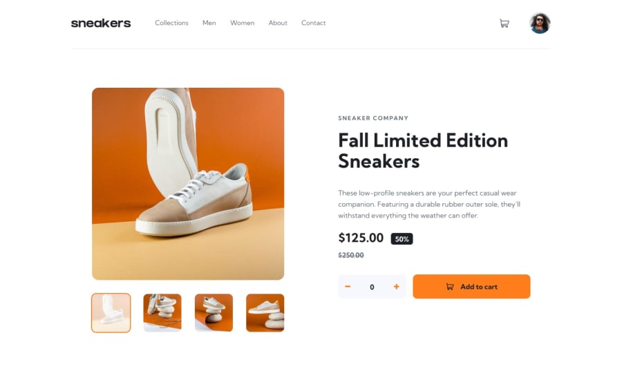
Design comparison
Community feedback
- @isprutfromuaPosted over 2 years ago
Hi there. You did a good job 😎
keep improving your programming skills🛠️
your solution looks great, however, if you want to improve it, you can follow these steps:
✅ It's better to disable the button when quantity is set to 0. Or you can display a notification that the user needs to set the quantity of the product
✅ Can't open cart within the keyboard
✅ You Need to Stop Targeting Tags in CSS. When you add CSS directly on tags, your markup can’t change. Your style is tightly coupled to your DOM, and any change increases the risk of breaking things.
✅ pay attention to the automatic report on your solution. you need to fix html and a11y errors
I hope my feedback will be helpful. You can mark it as useful if so 👍
Good luck and fun coding 🤝⌨️
Marked as helpful0
Please log in to post a comment
Log in with GitHubJoin our Discord community
Join thousands of Frontend Mentor community members taking the challenges, sharing resources, helping each other, and chatting about all things front-end!
Join our Discord
