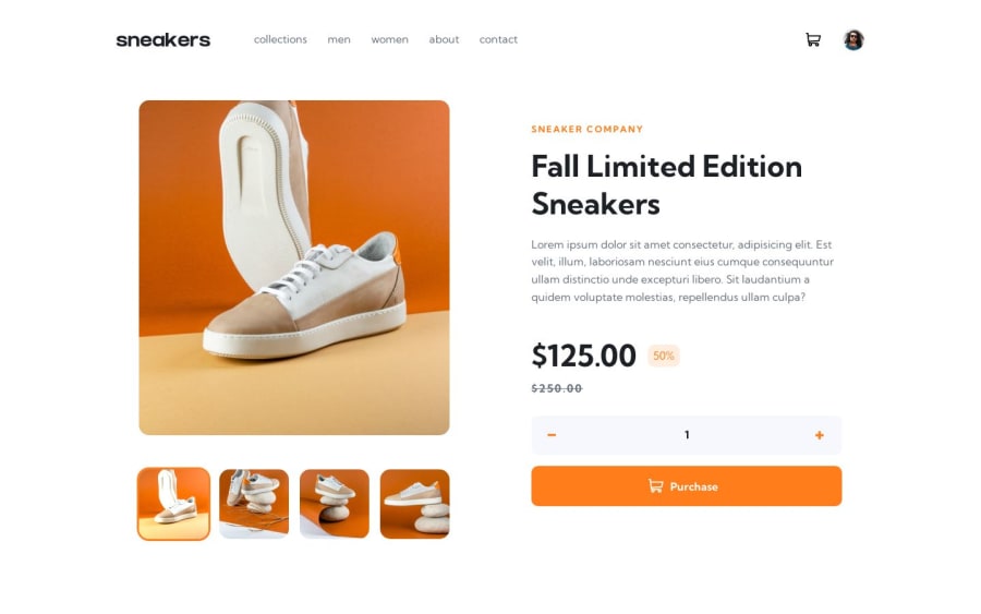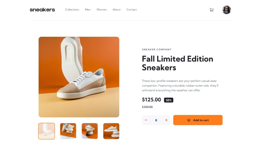
Design comparison
SolutionDesign
Solution retrospective
Feel free to leave feedback and help me improve my code structure or even the solution!
Hi there! This is my attempt at the Ecommerce Product Page.
Time Spent: A week
Challenge faced:
- css is not organised (Fix with CUBE CSS)
- the cart logic (Plan and Write my thoughts on paper really help the process)
Lesson I learnt:
- The thing that really help me complete this challenge easier is that I take notes on all the styling(color, text, spacing) of the reference on Figma. After I did that, I just put everything down to CSS with ease.
- CUBE CSS: let CSS do the job. Also, utility class makes styling much much easier.
This is what I practicing:
- Plan everything on Figma
- CUBE CSS
- Transition (how to make transition more smooth)
Happy Coding everyone :D
Community feedback
Please log in to post a comment
Log in with GitHubJoin our Discord community
Join thousands of Frontend Mentor community members taking the challenges, sharing resources, helping each other, and chatting about all things front-end!
Join our Discord
