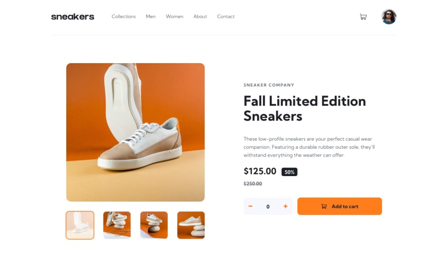
Submitted almost 3 years ago
E-commerce product page challenge hub using html, css and vanilla js
@Ebulor
Design comparison
SolutionDesign
Solution retrospective
any feedback is appreciated :)
Community feedback
- @Li-BeePosted almost 3 years ago
Soooo close to the design well done - will use this as a guide.
Couple of things i noted -
- The width of the font on the right and the button seems to be smaller than the design consider making the width wider.
- The first picture underneath the main picture needs the overlay and orange border to simulate it has been selected.
- There are a few accessibility and validation issues which need to be solved. Suggest you add
<main></main>to the <body> - this should clear the landmarks comments.
Marked as helpful0@EbulorPosted almost 3 years ago@Li-Bee thank you so much for going through it, I'll implement what you noted. Thanks once again!
0
Please log in to post a comment
Log in with GitHubJoin our Discord community
Join thousands of Frontend Mentor community members taking the challenges, sharing resources, helping each other, and chatting about all things front-end!
Join our Discord
