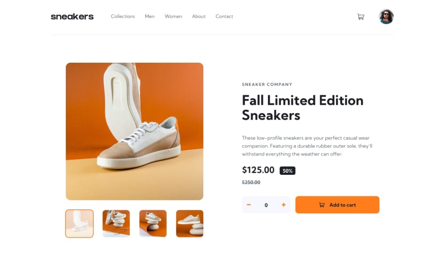
Design comparison
Community feedback
- @Chijioke91Posted almost 3 years ago
Thank you Matias for the feedback. From the code, I broke down the app into components and I also used folders to separate the different components. I also used react-router-dom hence the reason why I had a pages folder. I also had a context folder that managed my states. Could you help be more specific on the confusion you're having, I'd be willing to make the necessary corrections.
Regards.
0 - @LeoCaprilePosted almost 3 years ago
I don't know what file arquitecture you used, but it's really difficult to understand your code, You are using react like a template engine and react is not a template engine. So try to make more components and add individuality by doing more components. Read about the different type of arquitectures there are. The final result is Nice, but if we talk about escalabilty, i would re made the arquitecture. I Say, always go for redability of your code. Very good job!
0 - @anoshaahmedPosted almost 3 years ago
To get rid of the accessibility/HTML issues shown in your Report:
- wrap everything in your body in
<main>... OR use semantic tags ... OR giverole=""to the direct children of your<body>... Click here to read more <section>and<article>usually need a heading; so if you don't need a heading in it, use some other element such as<div>
Read your Report for more information.
Great job! :)
0@Chijioke91Posted almost 3 years ago@anoshaahmed thank you so much for the feedback. I'd make the changes needed.
1 - wrap everything in your body in
Please log in to post a comment
Log in with GitHubJoin our Discord community
Join thousands of Frontend Mentor community members taking the challenges, sharing resources, helping each other, and chatting about all things front-end!
Join our Discord
