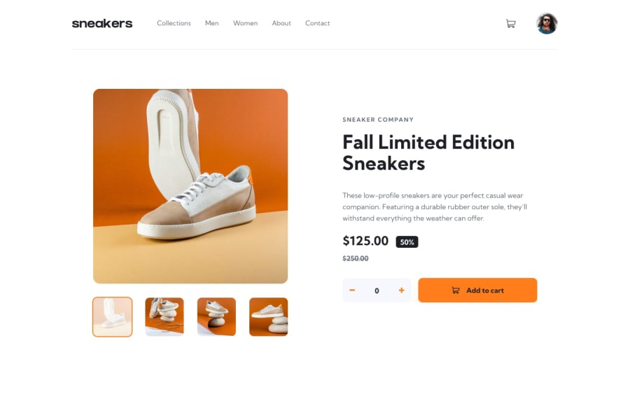
Design comparison
Solution retrospective
Hey all,
This was a challenge! I learned a lot in the process of building this. I'm still struggling to make everything look the way I want it to on different screen sizes. If I use a large monitor to view the app while I code, it throws things off for me. Anyone have any tips to help with that?
Thanks :)
Community feedback
- @jasonkartzPosted about 2 years ago
Hi - you could either use a parent container for the entire layout, or just the header. Then set a max-width so the contents won't go far off to the sides for wider screens. I usually set the max-width the same as the design's desktop width, which is 1440px in this case.
You can take a look at my submission for reference. I did my version with vanilla JS instead of React, but the concept is the same. Hope that helps! Great work!
0
Please log in to post a comment
Log in with GitHubJoin our Discord community
Join thousands of Frontend Mentor community members taking the challenges, sharing resources, helping each other, and chatting about all things front-end!
Join our Discord
