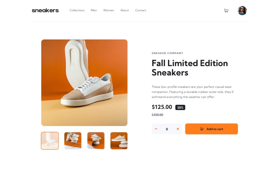
E-commerce product page – Built with Next.js, Tailwind CSS, TypeScript
Design comparison
Community feedback
- @dhillman1989Posted over 2 years ago
Nice work.
I like the way that when you add items, the basket pops into focus, and the checkout loading screen is a nice touch. A suggestion would be that once you add to the basket the counter on the product reset to 0, just my thoughts.
Responsive menu is well implemented at lower screen size, but maybe needs an animation or transition to make the opening/closing of the menu seem smoother and less jarring.
Overall nice implementation of the functional design.
0@dominikrubroederPosted over 2 years ago@dhillman1989 thanks! Yes you’re absolutly right. There are definitely some animations missing, espicially on the initial page load.
I’m was/am about to add them to the page like for example on https://intro-section-with-dropdown-navigation-website.vercel.app or https://expenses-chart-component-website.vercel.app
0
Please log in to post a comment
Log in with GitHubJoin our Discord community
Join thousands of Frontend Mentor community members taking the challenges, sharing resources, helping each other, and chatting about all things front-end!
Join our Discord
