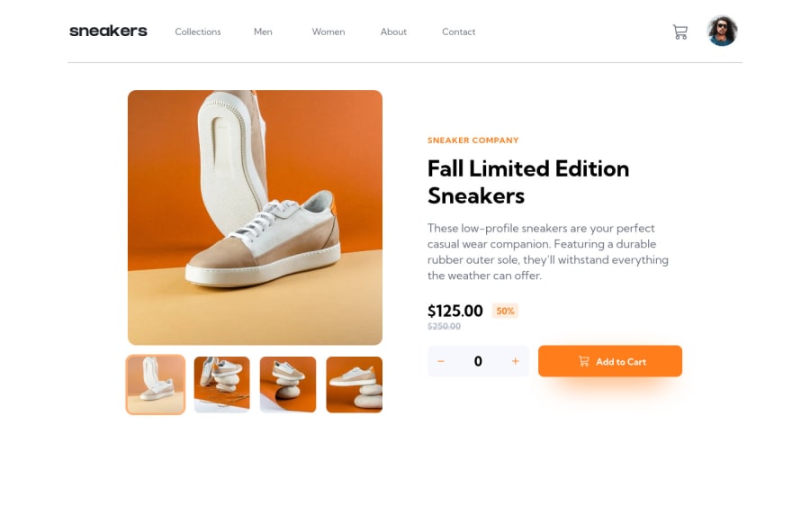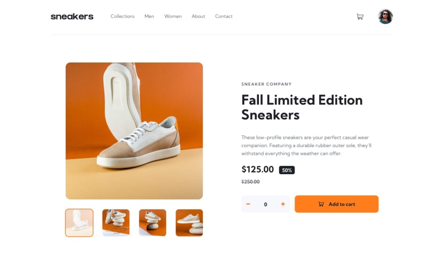
E-commerce product page build using html/sass and vanilla javascript.
Design comparison
Solution retrospective
Comments on I can improve my skill will be highly appreciated!
Community feedback
- @fosteecoPosted over 2 years ago
The -100vw left property is nice. I usually use a percent but I think this solution makes more sense. Your javascript is also very organized and easy to read. The desktop gallery modal isn't working for me. The breakpoints for the mobile version seem too large as well. It's hard to pull up my console and troubleshoot the desktop version and I'm on a pretty large screen. Looks good for the most part. Keep up the good work!
Marked as helpful2@Pomz010Posted over 2 years ago@fosteeco Hi, thank you for your feedback. I haven't created a media query for tablet sizes, that's why if you shrink the screen to smaller than 1440px, the layout goes straight for mobile screen size which is min-width of 375px. But I'll be adding one on these following days maybe. Can you tell me on which part the modal gallery is not working? Thank you!
0
Please log in to post a comment
Log in with GitHubJoin our Discord community
Join thousands of Frontend Mentor community members taking the challenges, sharing resources, helping each other, and chatting about all things front-end!
Join our Discord
