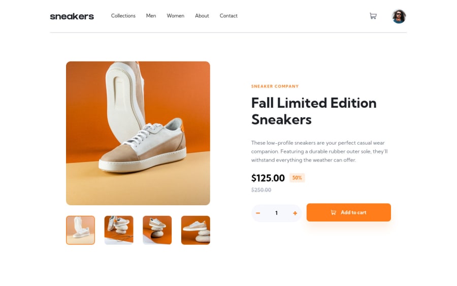
Design comparison
SolutionDesign
Solution retrospective
If you notice when you click on the hero img and scroll down, if your screen doesn't fill the top of the content, the background color doesn't cover the entire bottom area. I was thinking for a while but I couldn't think of how to solve it, if anyone knows a solution to this it will be welcome, thanks.
Community feedback
- @jkellermanPosted about 2 years ago
You could try placing the overlay outside of your container class, I think what's happening is the overlay is being confined to its parent elements.
Here is a good tutorial on this https://www.youtube.com/watch?v=gLWIYk0Sd38&t=167s
Hope this helps!
1
Please log in to post a comment
Log in with GitHubJoin our Discord community
Join thousands of Frontend Mentor community members taking the challenges, sharing resources, helping each other, and chatting about all things front-end!
Join our Discord
