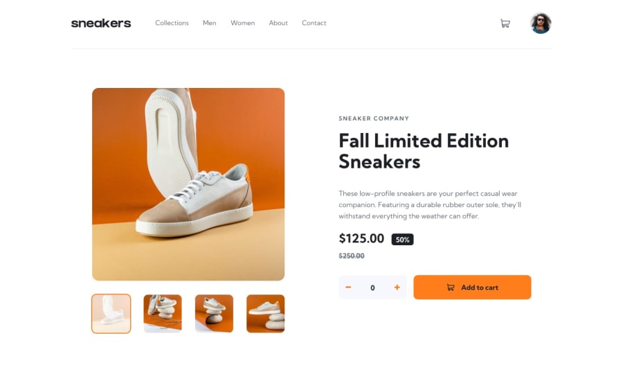
Design comparison
SolutionDesign
Community feedback
- @nawfelsekrafiPosted over 2 years ago
Great @siafromspace 😊🎉..
Responsiveness is solid, the flow is smooth.. in addition to small details like delete items color change on hover ♥ etc.. just one small note.. you can set overflow-x: hidden on big screens to avoid some unwanted horizontal scrolling. That's all . btw your solution is visually more beautiful that the design , at least in my opinion..😅 Happy coding and looking forward for you new creations 😉
Marked as helpful1@siafromspacePosted over 2 years ago@nawfelsekrafi alright ! will fix the overflow problem. you’re so sweet, thank you sm ! ❤️
1
Please log in to post a comment
Log in with GitHubJoin our Discord community
Join thousands of Frontend Mentor community members taking the challenges, sharing resources, helping each other, and chatting about all things front-end!
Join our Discord
