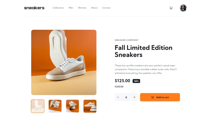
Responsive e-commerce page with Tailwindcss and JavaScript
Design comparison
Solution retrospective
This took me an awful lot of time to complete. But I had a lot of fun completing it(somehow)
I would like to make the delete option in the cart functional so that it clears the content and displays the "Cart is empty" message.
Also, the style for the cart content doesn't load properly, for example, if you open the cart when it is empty and proceed to load it up afterward, the elements tend to follow the empty cart styling, same with when you clear the cart and its supposed to be empty, both styles show at the same time.
Lastly, the lightbox overlay, the bottoms, and the thumbnails are absolutely positioned, on screens larger than laptops, and the buttons tend to move out of position, I tried using media queries to fix this, but then it affects the layout on laptop screens.
This project greatly helped me with my Javascript journey, I learned a lot and I look forward to learning more, so any feedback on how to improve my code is warmly welcome.
Join our Discord community
Join thousands of Frontend Mentor community members taking the challenges, sharing resources, helping each other, and chatting about all things front-end!
Join our Discord
