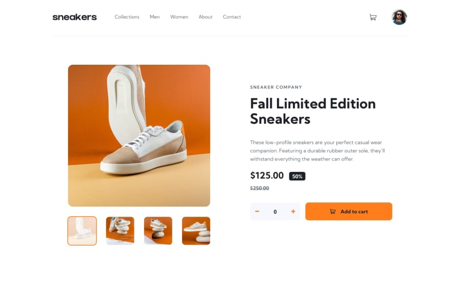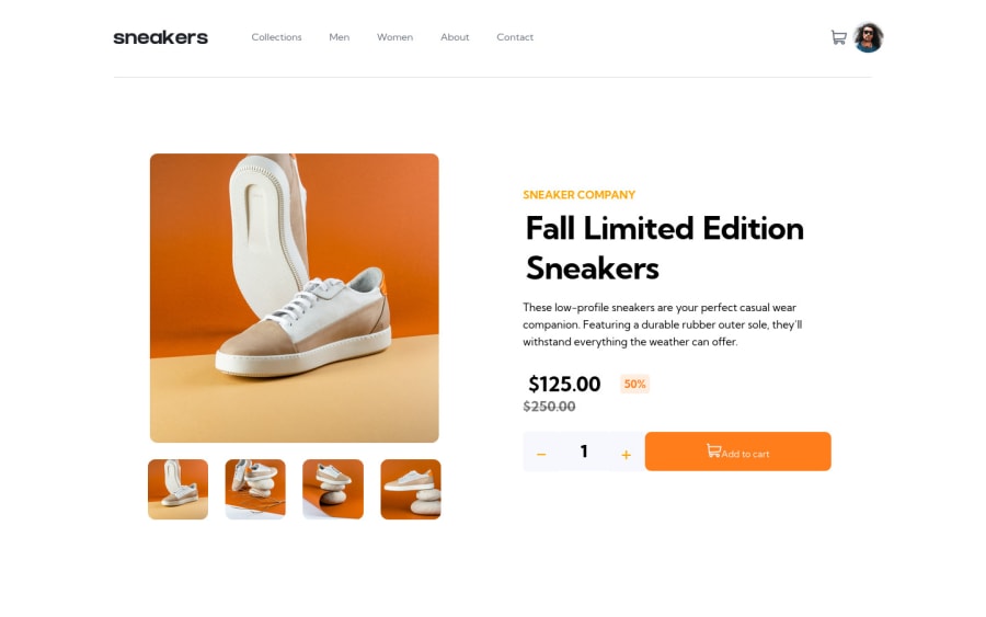
Solution made with Html, css and JavaScript base
Design comparison
Solution retrospective
What was difficult for you while building the project?
The gallery part was quite difficult for me and I feel that this is not the best way to do it but for now I don't know of a better way to do it
What areas of your code are you unsure of?
The responsive design is something that I'm not sure if it's right
Community feedback
- @nelsonleonePosted almost 2 years ago
Hello, congrats on completing the project. It looks nice
If you would check it out, there some thing you would need to try out to improve your solution. firstly, your modal, clicking the small preview images should render them in the big modal view.
You can target the src of the clicked it , then render that source in the big preview. you can use the getattribute("src")
secondly** your carts seems to not show the number of items on the cart icon. You can check to see the cause , it you didn't write a code for it , you can just use the length of the cart items data, then render it.
Marked as helpful1@ViktorChsPosted almost 2 years ago@nelsonleone Thank you very much for taking the trouble to review my project, I will make a list with everything mentioned and I will patch it to improve it :)
0 - @catherineisonlinePosted almost 2 years ago
Hello 🙌🏻 Your solution looks great however here are a couple of things you can improve which I hope will be helpful! 😎
First of all, do not use a tag inside the buttons. You either use buttons or use a tag only. Buttons are used for interactivity on the webpage itself, like pop-ups or modals, for example. a tag is usually used for links, for the pages that redirect you to another page or website.
I would also add some transitions for active states (when colors change on hover). It creates more interactivity and makes the project look cooler. Active states can be done on buttons, links, titles which act like links, or anything else, you choose.
You can read more about it here, in case you haven’t done much of it: https://www.w3schools.com/css/css3_transitions.asp
The arrow image for the sliders should be used more as a decorative image, rather than being attached to any content.
Alt attribute for the image is important in order to specify alternative text for the image in case it will not be displayed. Using alt attribute is good for not only accessibility but also SEO and for situations when the image is loading too slowly. If the image is just for decoration you can still write an alt attribute but leave it empty, such images don’t need any alt tag but you will need to also add aria-hidden=“true”. What aria-hidden does is that it removes the entire element from the accessibility tree.
If otherwise, you need to use an alt tag to describe the image. To write an alt tag you need to describe the content and purpose of the image and try not to use words like “picture of” or “image of”.
Marked as helpful1@ViktorChsPosted almost 2 years ago@catherineisonline I really appreciate your time to review my solution. I will take into account each one of the things to be able to change what you mention in your comment. I'll get to work :)
0
Please log in to post a comment
Log in with GitHubJoin our Discord community
Join thousands of Frontend Mentor community members taking the challenges, sharing resources, helping each other, and chatting about all things front-end!
Join our Discord