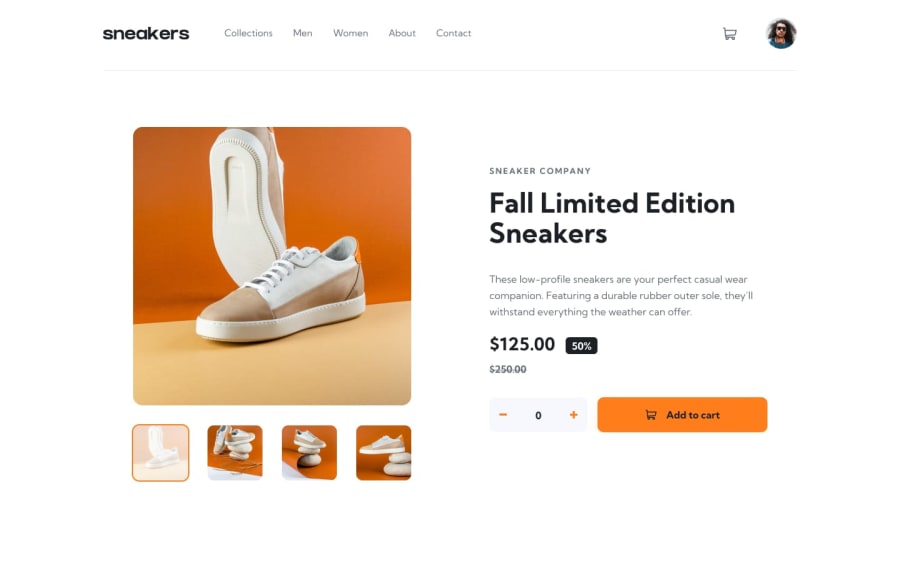
Design comparison
Solution retrospective
Hello everyone!
I tried to take my time with this challenge and make it as aesthetically pleasing and as feature-full as I could.
In addition to the usual goals such as responsiveness, semantic HTML, here is a list of features and that I implemented in this solution:
- Modals with click-away listeners for the cart, the lightbox gallery, and the mobile menu.
- A carousel with swipe support.
- Stacking dismissble toast messages.
The most important thing I learned from doing this challenge: spacer divs!
The technologies and libraries I used:
- Typescript
- React
- Framer Motion
- SCSS
I hope it turned out well. I welcome any constructive or destructive criticism.
Community feedback
- @khaya05Posted about 2 years ago
Great job man, I love your solution to this project. I also love how you added the transitions on the aside menu, images gallery, and that bottom feedback.
Very inspiring!!👍
1@sahand-masolehPosted about 2 years ago@khaya05 Thank you Khaya, I appreciate it.
0
Please log in to post a comment
Log in with GitHubJoin our Discord community
Join thousands of Frontend Mentor community members taking the challenges, sharing resources, helping each other, and chatting about all things front-end!
Join our Discord
