Design comparison
Community feedback
- @JeanMiesesPosted almost 3 years ago
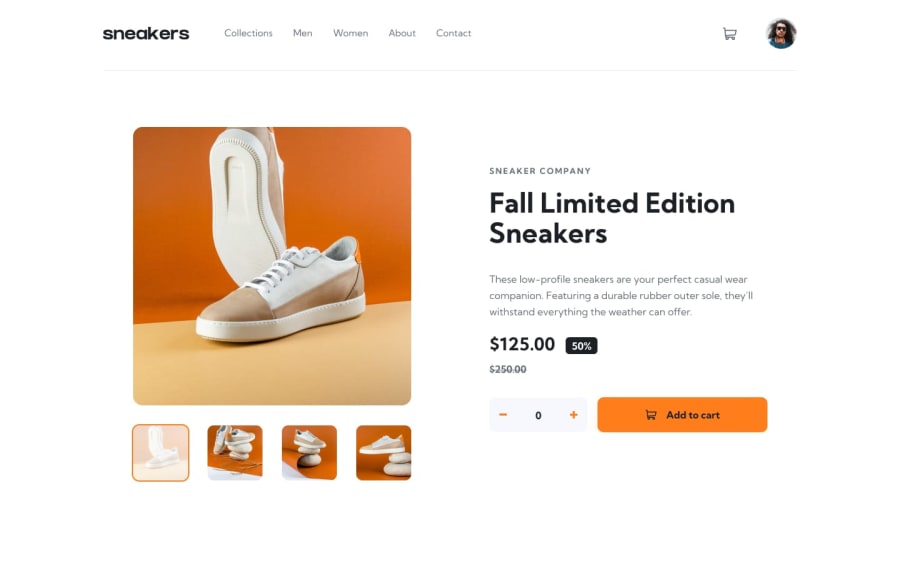
Hey brother. There are a few things you should fix. The "product-section" should be centered vertically. Add a working "Cart' component as well, so when I click add to cart button, it adds the product to the cart. Also, when I click to add quantity or decrease, the adds to cart button moves. I think it is cuz the padding. I feel that is something you should look into.
I love the design. It is way better than mine. I missed the cart image in the add to cart button as well. And how did you implement the carousel? I used a library for it called Splide cuz coding it on my own would have taken a bit of work and I am too lazy. Your carousel looks amazing.
here is my project https://www.frontendmentor.io/solutions/ecommerceproductredux-dei3tJbWL
0
Please log in to post a comment
Log in with GitHubJoin our Discord community
Join thousands of Frontend Mentor community members taking the challenges, sharing resources, helping each other, and chatting about all things front-end!
Join our Discord
