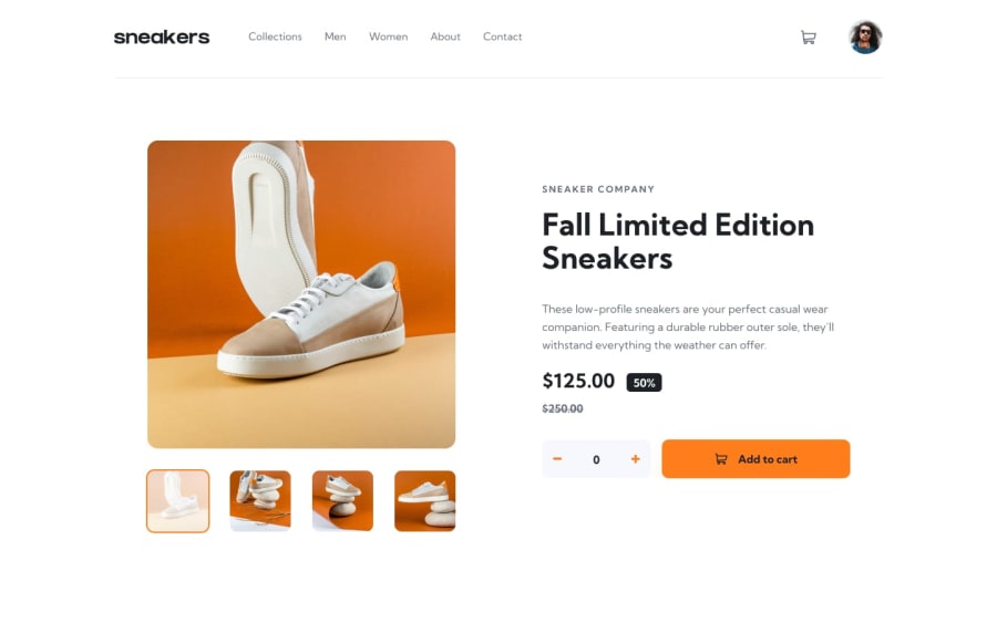
E-commerce product con Carrito y con Responsive Design (HTML, CSS, JS)
Design comparison
Solution retrospective
Hello! 👋 My name is Edwin Anel Gonzalez and this is my solution for the sixth challenge.
Any recommendation to improve my code is welcome.
Greetings and success 🙌
Community feedback
- @ZeyadMohamed1805Posted almost 2 years ago
Hello there! You did amazing on this project :D I do have some improvement suggestions:
- I recomment to add the (cursor: pointer;) css property to the images. It makes a huge difference for the user's experience.
- When the main image is clicked, there should be a close icon to click so that the user can return to the page. Unfortunately, the icon doesn't appear and there is no way back except to refresh the page.
- When there are no items added to the cart, it should display "Your cart is empty." Try replacing the checkout button with this paragraph when the cart is empty. 4.The remaining would be minor adjustments.
Regardless of these tips, your website is awesome & your hard work is clearly displayed. I really hope this feedback helps. Please check out my solutions and react / comment to them. It really helps!
0@Anell-devPosted almost 2 years ago@ZeyadMohamed1805
The icon to close is there, I think it's because of the zoom that doesn't appear.
Try zooming to 80. Tell me if you can see it I'll be attentive.
Regarding the hover, I completely forgot, but I always put them on.
On the other hand, thank you for your comment, it is very helpful. 🙌🤜🤛
1@ZeyadMohamed1805Posted almost 2 years ago@Anell-dev I zoomed out to 80% and I did see it! You don't usually expect the user to view your website at 80% so maybe trying to make the icon appear on the default 100% would be worth it.
Finally, don't let this point distract you from how great your website actually is! Keep up the great work mate!
0@Anell-devPosted almost 2 years ago@ZeyadMohamed1805
You are absolutely right, the user does not usually see the pages at 80%.
I will take that into account and from now on I will create the pages at 100%.
I already added the hover and fixed the closing x so that it would be seen at 100%.
Let me know what you think!
1@ZeyadMohamed1805Posted almost 2 years ago@Anell-dev
Problem Fixed! 🔝👌, Hovers are Sharp! 😎👊, Simply Fabulous!
Keep it up bro!
0@Anell-devPosted almost 2 years ago@ZeyadMohamed1805
Thank you very much for your support and recommendations. Greetings and success my friend.🙌🤜🤛👋
1
Please log in to post a comment
Log in with GitHubJoin our Discord community
Join thousands of Frontend Mentor community members taking the challenges, sharing resources, helping each other, and chatting about all things front-end!
Join our Discord
