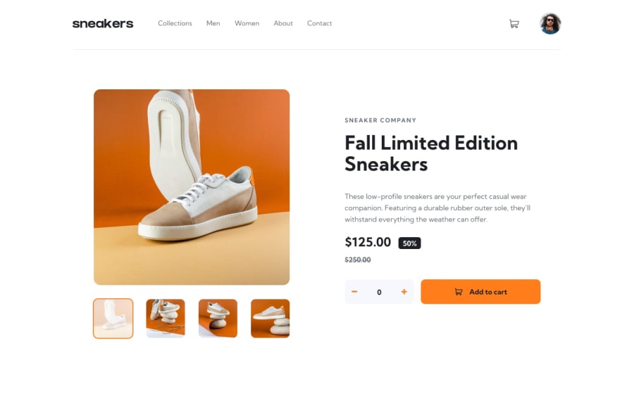
Design comparison
Community feedback
- @carlwickerPosted almost 3 years ago
Hey man, good job on the layout however there are some issues that should be addressed.
- the page content seems to jump about when you mouse over a product thumbnail
- default to add to cart should 1 not 0.
- adding additional items to the cart should be added as a new list item rather than just increasing the quantity.
- clicking on a navigation clears the cart.
Finally fix those accessibility and HTML issues in the report.
Keep up the great work.
Marked as helpful1@ninjacanthi1995Posted almost 3 years ago@carlwicker Thank you so much for your advices.
However, for the first one, I don't feel like you said. I just put an opacity 0.5 for the hover state.
And for the 3rd one, because it's just one product, so I think it's should be ok to increase only the quantity.
For the rest, I'm agree with you.
0@carlwickerPosted almost 3 years ago@ninjacanthi1995 to be clear... with my browser inspect window open the sites functions work fine, with the inspect window closed the whole site jumps around when moussing over the thumbnails.
The whole site moves around if I hover over the navigation too.
I'm using Chrome.
Marked as helpful1@ninjacanthi1995Posted almost 3 years ago@carlwicker Ah ok. It's weird because I'm also using Chrome and I don't have that issue. But thanks for your remarks anyway!
0
Please log in to post a comment
Log in with GitHubJoin our Discord community
Join thousands of Frontend Mentor community members taking the challenges, sharing resources, helping each other, and chatting about all things front-end!
Join our Discord
