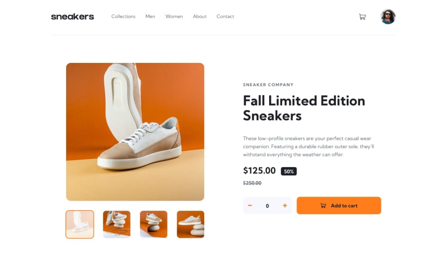
Design comparison
Solution retrospective
I changed some things in the challenge like adding 2 more layouts(to make the website more responsive, I decided to do that because I wanted to practice different styles and be more creative). Feel free to share your feedback with me, this will help me a lot!
Community feedback
- @mksoofianPosted over 1 year ago
Hi Lucas,
I totally get what you mean. It can be difficult for me to come up with my own layout for the in-between screen sizes... you did an awesome job with the alternative layout! tips hat
My constructive criticism would be for you to adjust the cart qty to display accurately in the pop-up above the icon. Otherwise, I think you provided a great solution.
-Mike
0
Please log in to post a comment
Log in with GitHubJoin our Discord community
Join thousands of Frontend Mentor community members taking the challenges, sharing resources, helping each other, and chatting about all things front-end!
Join our Discord
