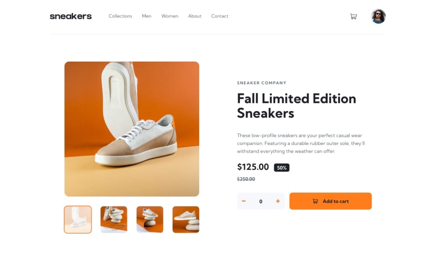
Design comparison
Community feedback
- @Ramz001Posted over 2 years ago
Nice job completing this challenge!
Well there a few problems that you should fix.
Firstly, Your website does not work on tablet I checked 768px wide and the website does not look good.
Secondly, The navbar underline hover effect is wrong it must not after the border but before the border and navbar is too tall.
Thirdly, your website has some semantic issues that needs to be fixed.
Also, It's really hard to press the buttons I mean plus and minus and button containers are positioned too close to add to cart button
It's a little subjective but I do not like cart icon hover effect and I think that just cursor pointer would be enough
I hope my feedback would help you!
Marked as helpful0@BazthosPosted over 2 years agoHello @Ramz001 !
Thanks for your feedback and for taking time to review my solution !
For point 1 and 2 :
-
I've updated my solution, I take the time to create a design for tablet (it's a mix between the 2 designs), hope you like it :)
-
Thank for pointing this out. Indeed, I had not taken the time to check properly, I was more focused on the given designs.
Then, concerning the semantic problems, I learned that the navbar must be unique (at least its HTML element). I need to change the 'cart' element to <section>, for that I will have to revise most of my CSS code (especially my <label> elements).
Don't hesitate to come back, I think I'll add some more improvements :)
Thanks again and happy coding!
0 -
Please log in to post a comment
Log in with GitHubJoin our Discord community
Join thousands of Frontend Mentor community members taking the challenges, sharing resources, helping each other, and chatting about all things front-end!
Join our Discord
