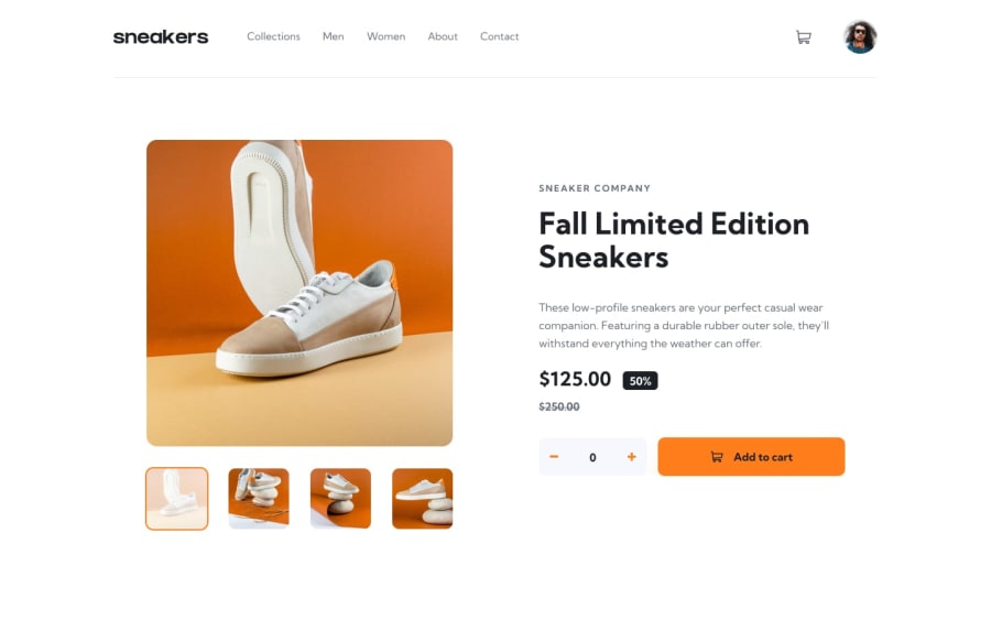
Design comparison
Solution retrospective
Really enjoyed being able to apply some more advanced JavaScript and responsive design principles to this project.
Notably, I tried building this project with scalability in mind and created the Product class to make it easier to reuse the shopping cart functionality if I were to add more products in the future.
The biggest challenge was building the logic where only one instance of the product was created when added to the shopping cart and it is updated with additional items should the user want to increase the purchased amount.
Would love some feedback on my semantic HTML (I felt like its a bit all over the place) and could be made prettier.
Also, felt like there was a lot of CSS to get the styling right between mobile and desktop views but it works so I guess I can't complain!
I was unfortunately unable to figure out how to get the desktop view lightbox to work - will have to revisit that challenge in the future!
Community feedback
Please log in to post a comment
Log in with GitHubJoin our Discord community
Join thousands of Frontend Mentor community members taking the challenges, sharing resources, helping each other, and chatting about all things front-end!
Join our Discord
